Divvy
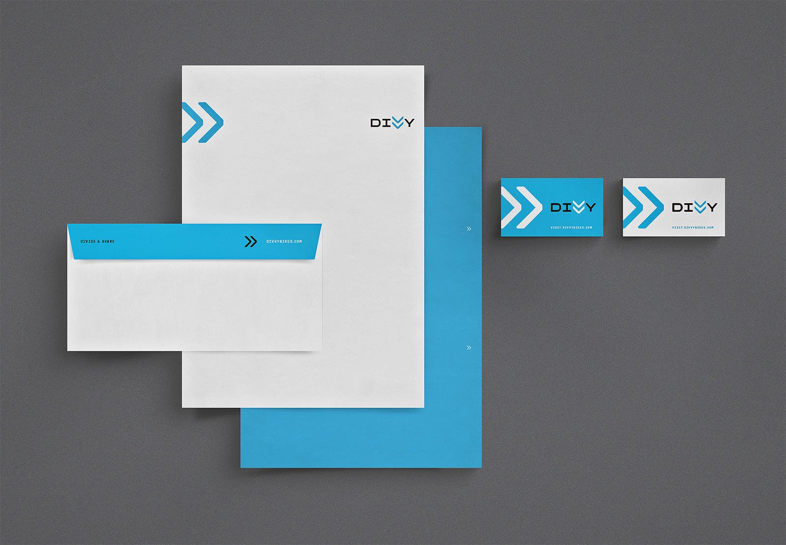
This project was a complete naming, brand and visual identity for Divvy Bikes, Chicago’s bike share system, including intensive research and design process in partnership with IDEO and completed at Firebelly.






Project Summary
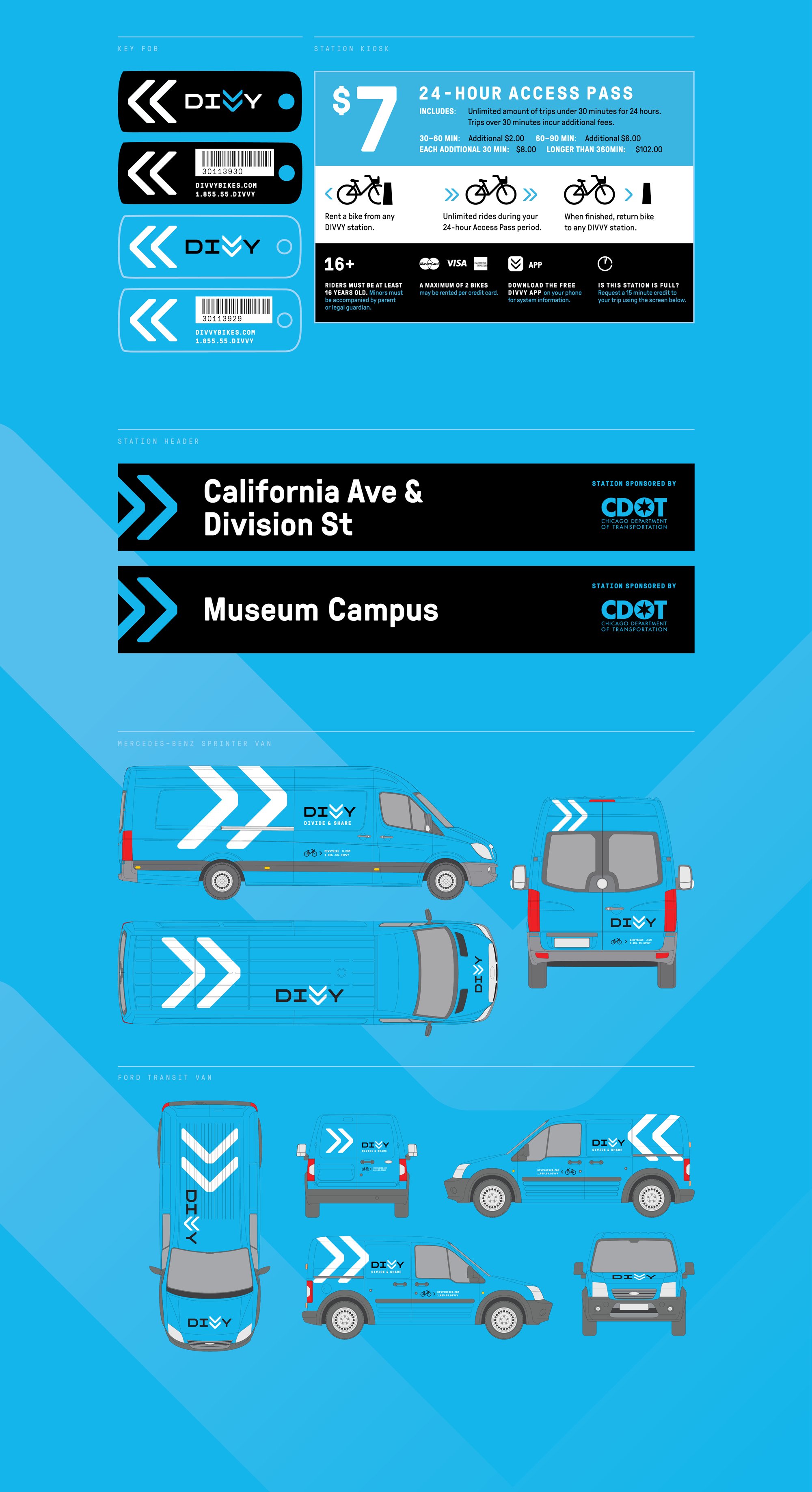
This project was a complete naming, brand and visual identity for Divvy Bikes, Chicago’s bike share system, including intensive research and design process in partnership with IDEO.
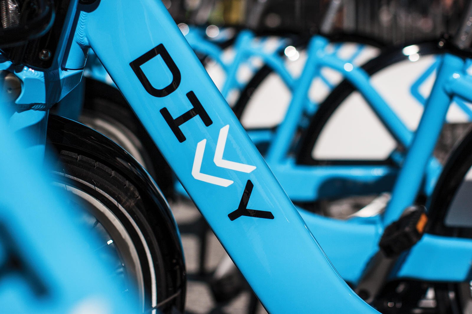
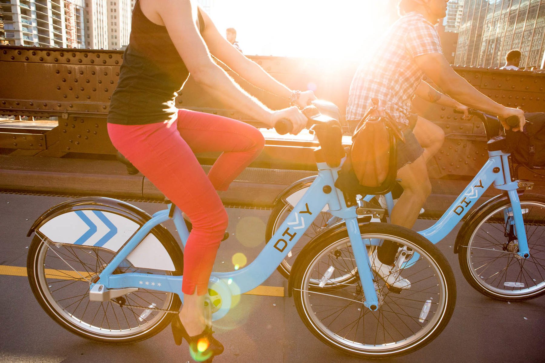
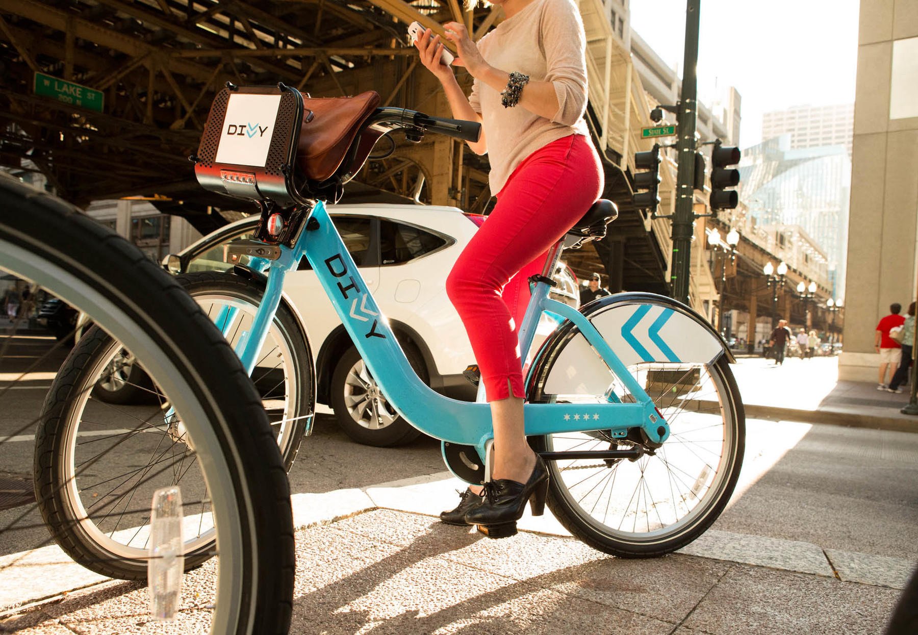
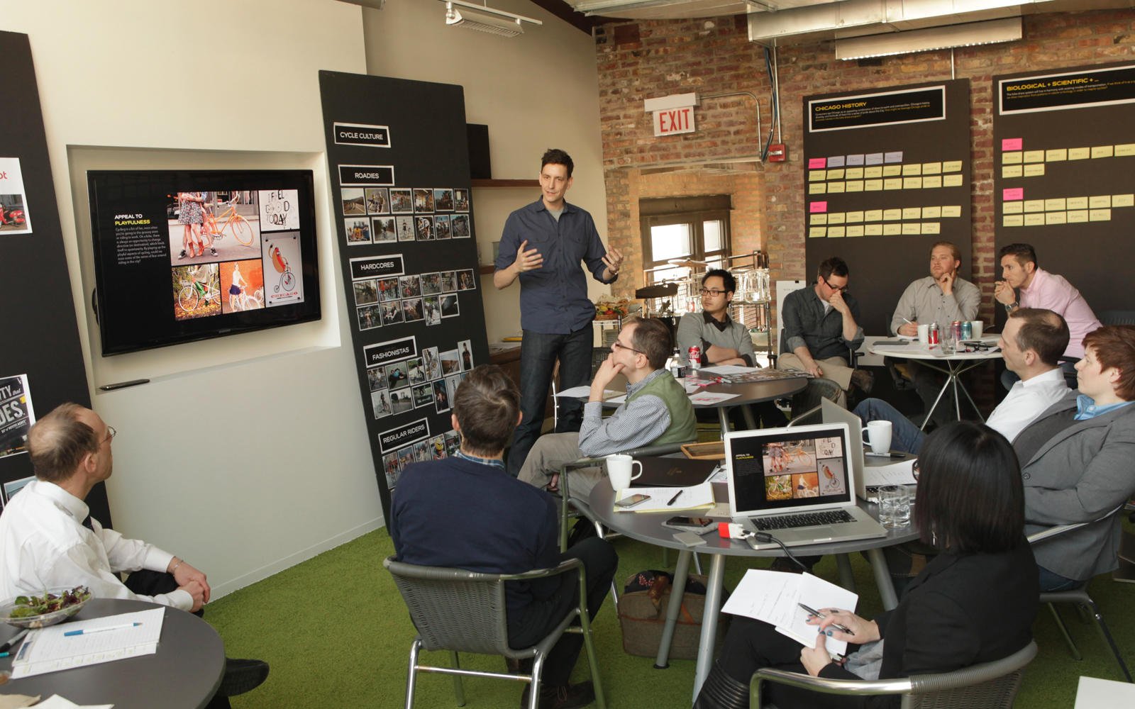
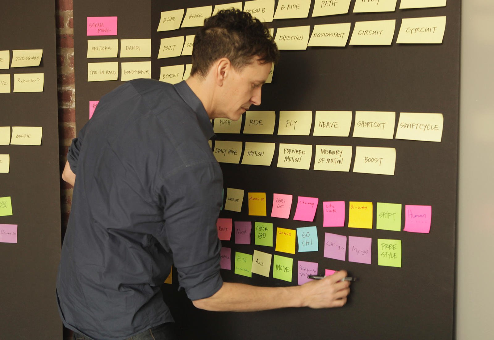
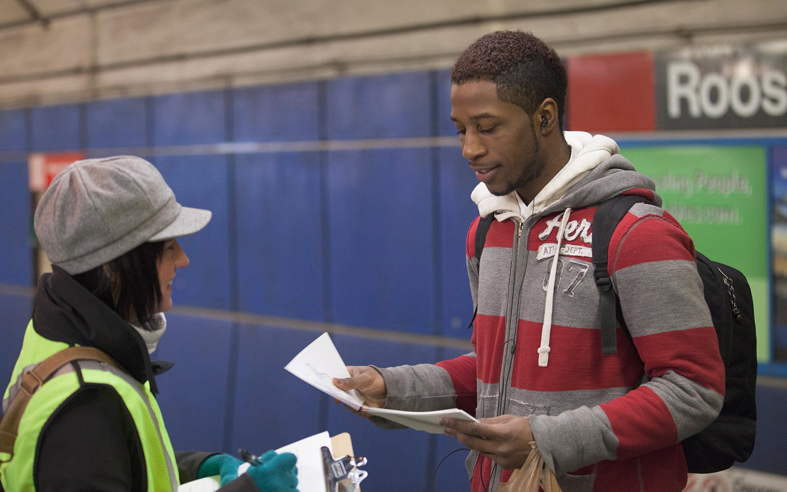
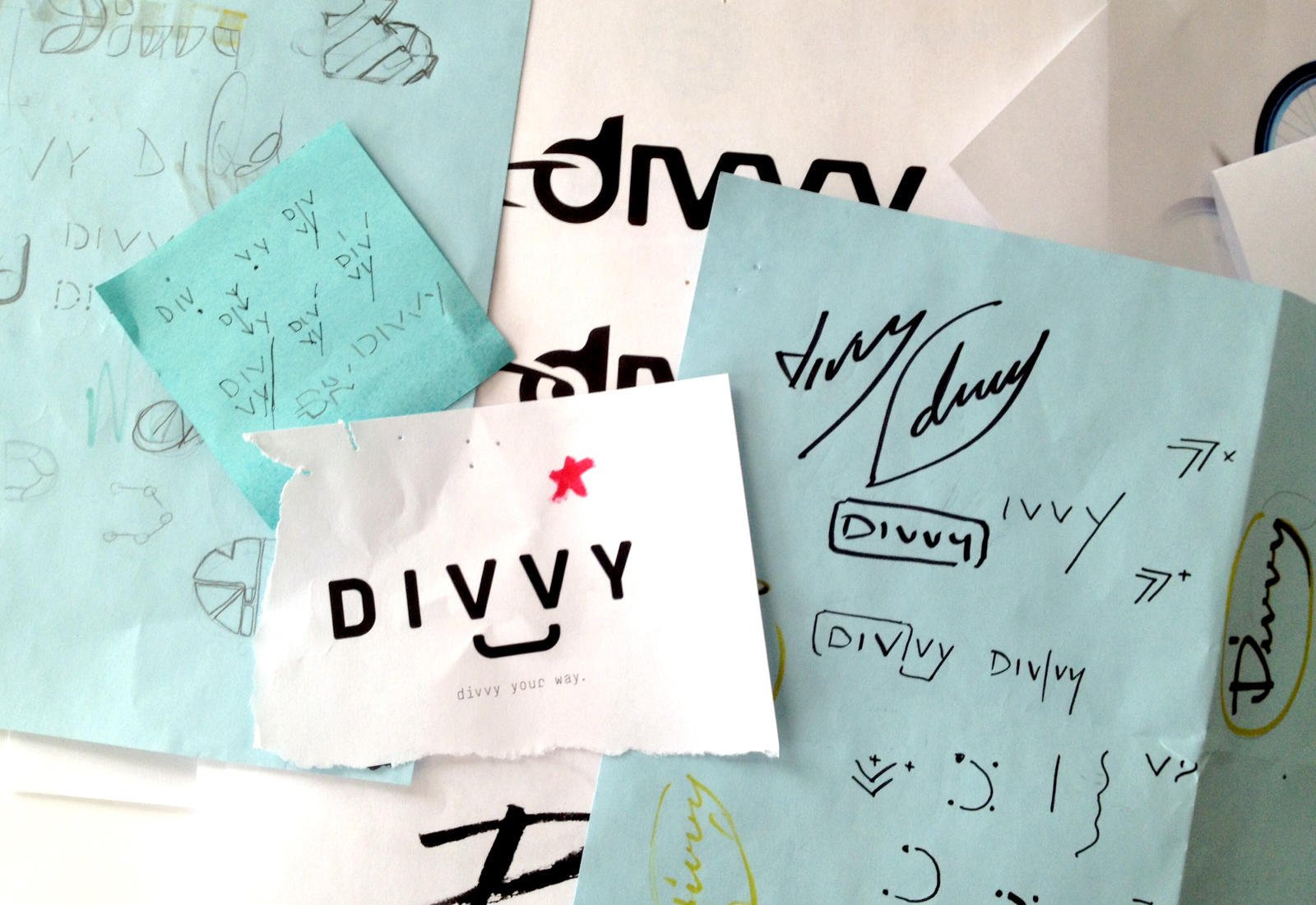
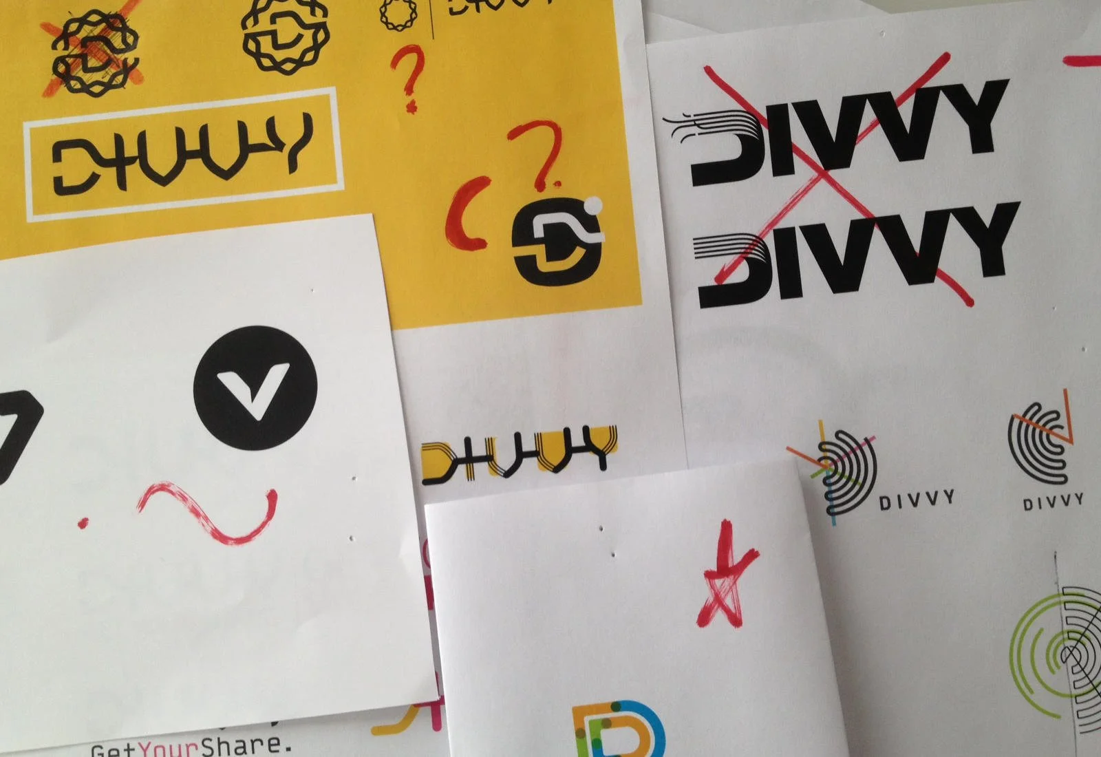
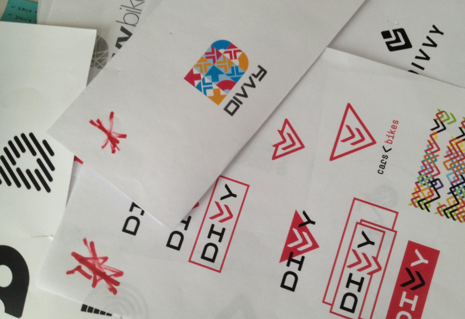
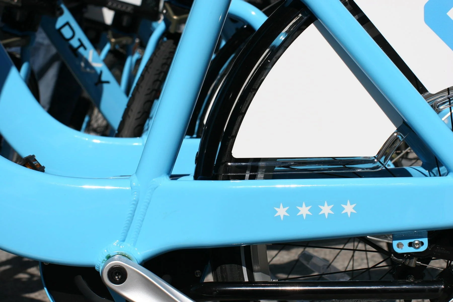
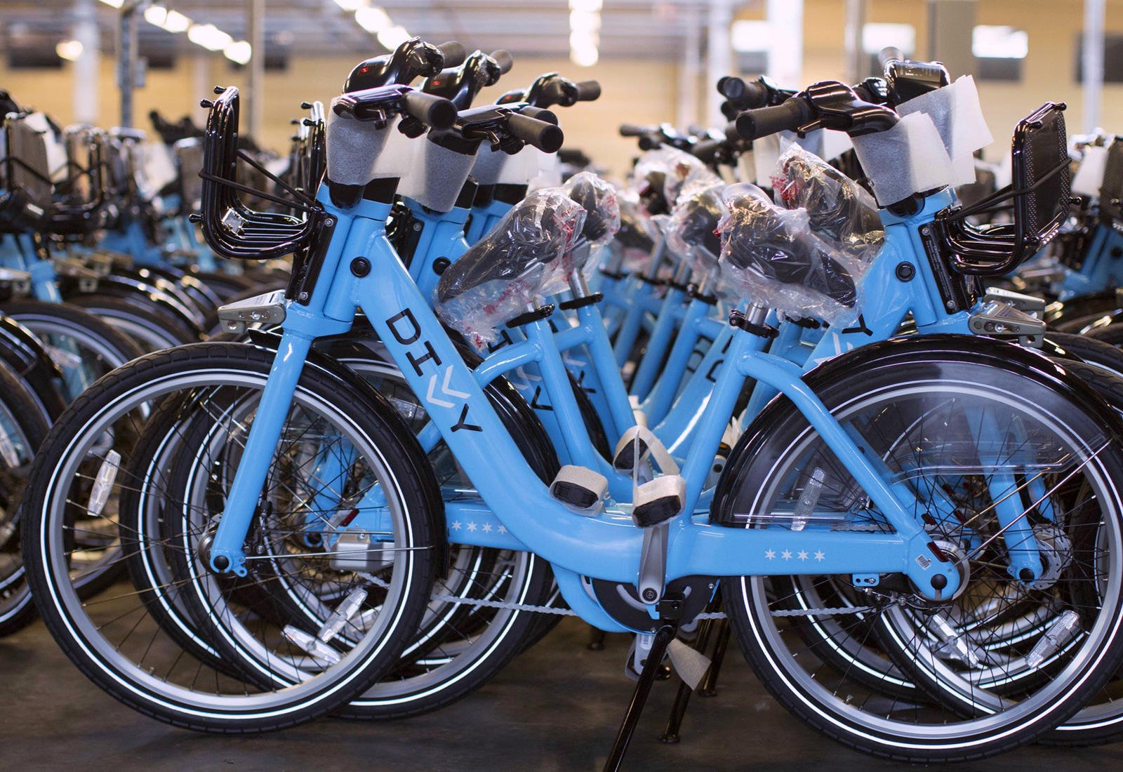
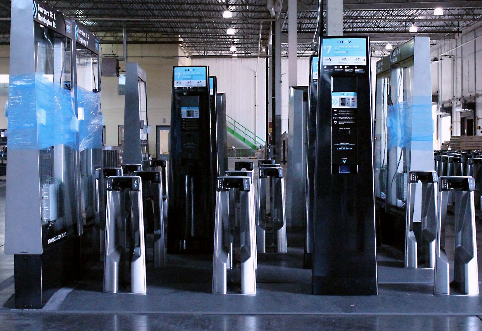
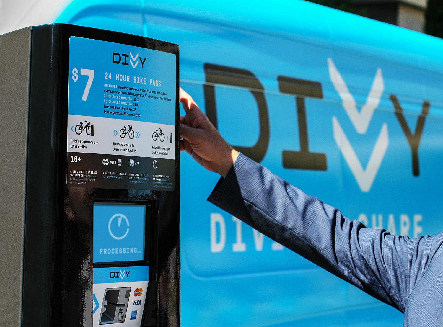
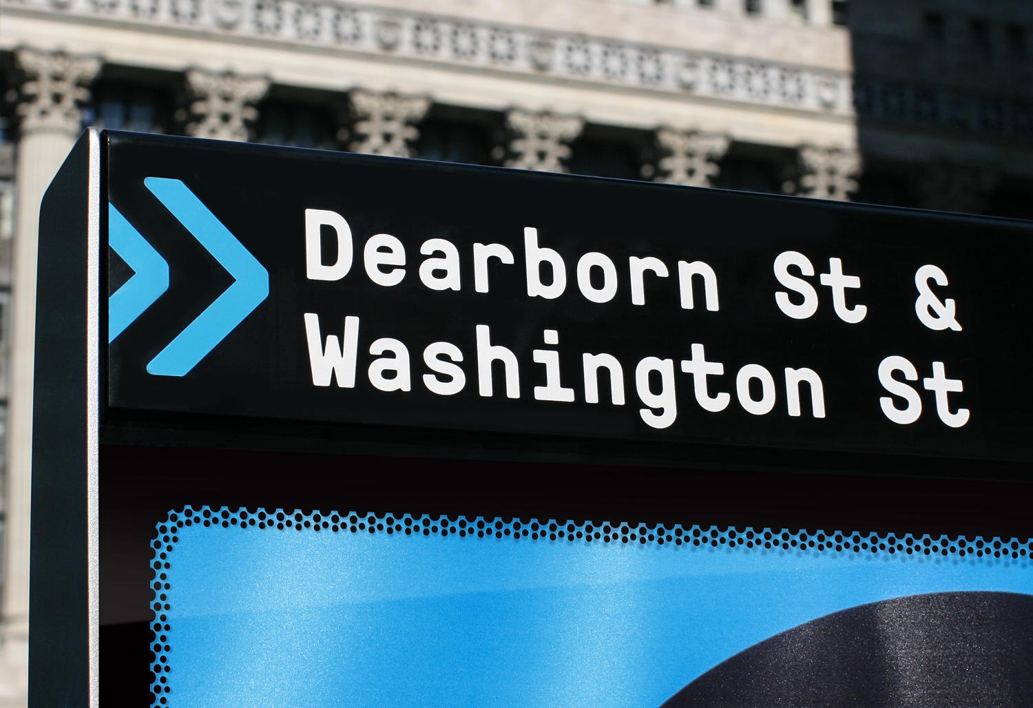
With project underway, the team arrived at Divvy — concise, memorable and downright fun to say, an easy addition to our city’s vernacular. “Do you Divvy?” With a name approved, we began designing the identity system, starting with the logo. Given what we learned from our initial research, we knew the Divvy brand had to feel practical yet fun, safe yet stylish, and undeniably Chicago.
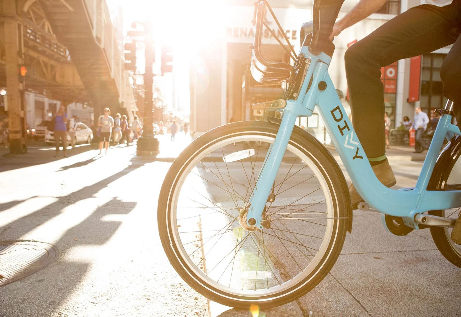
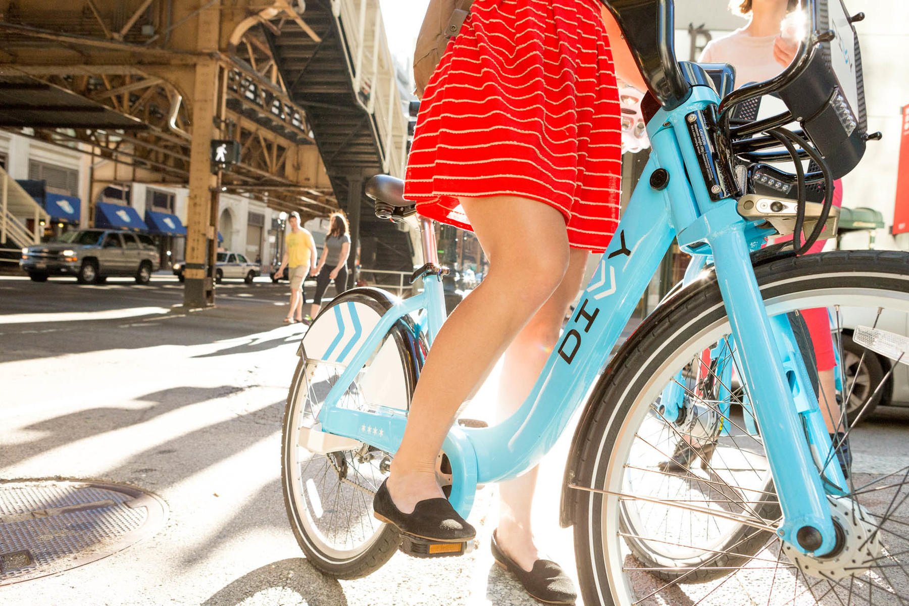
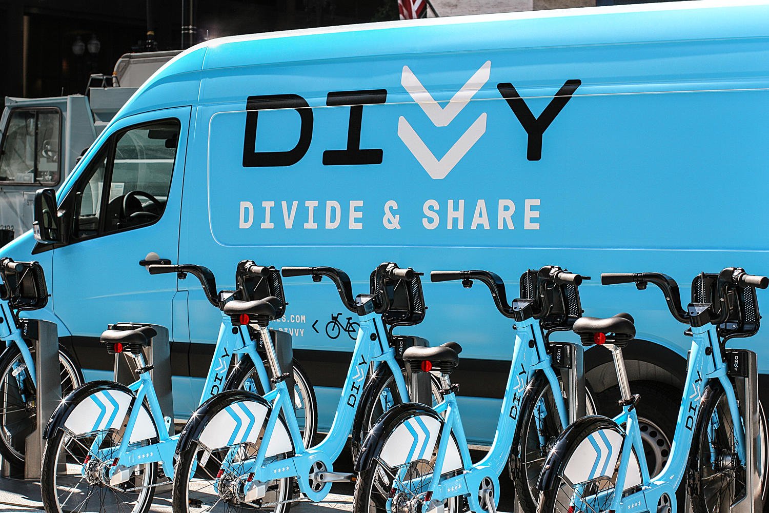
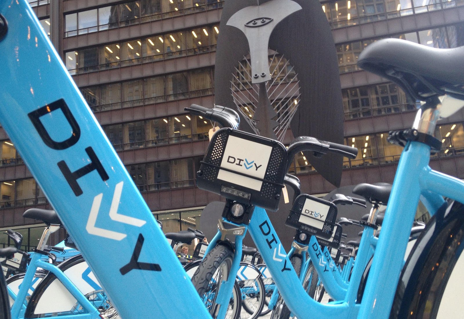
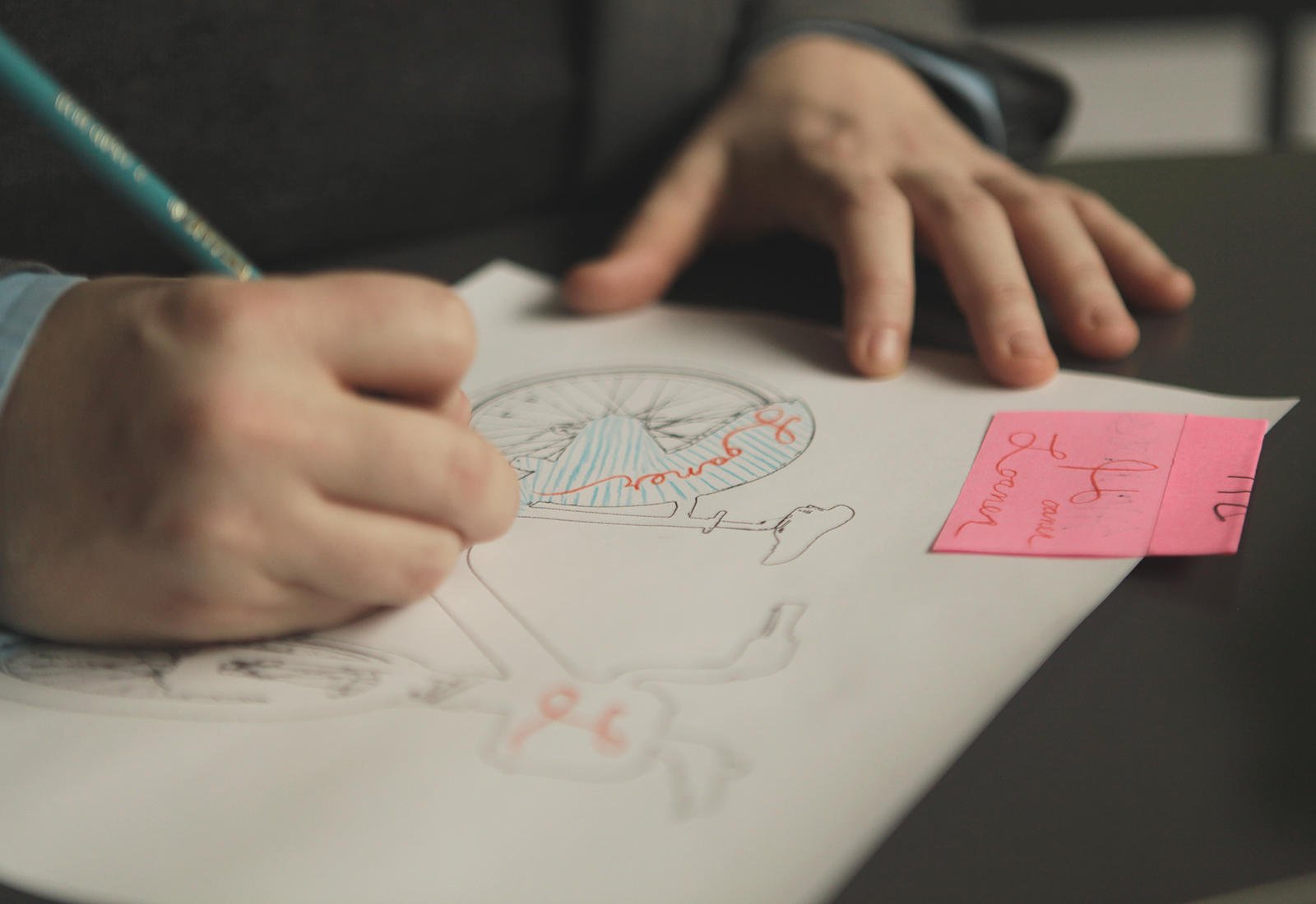
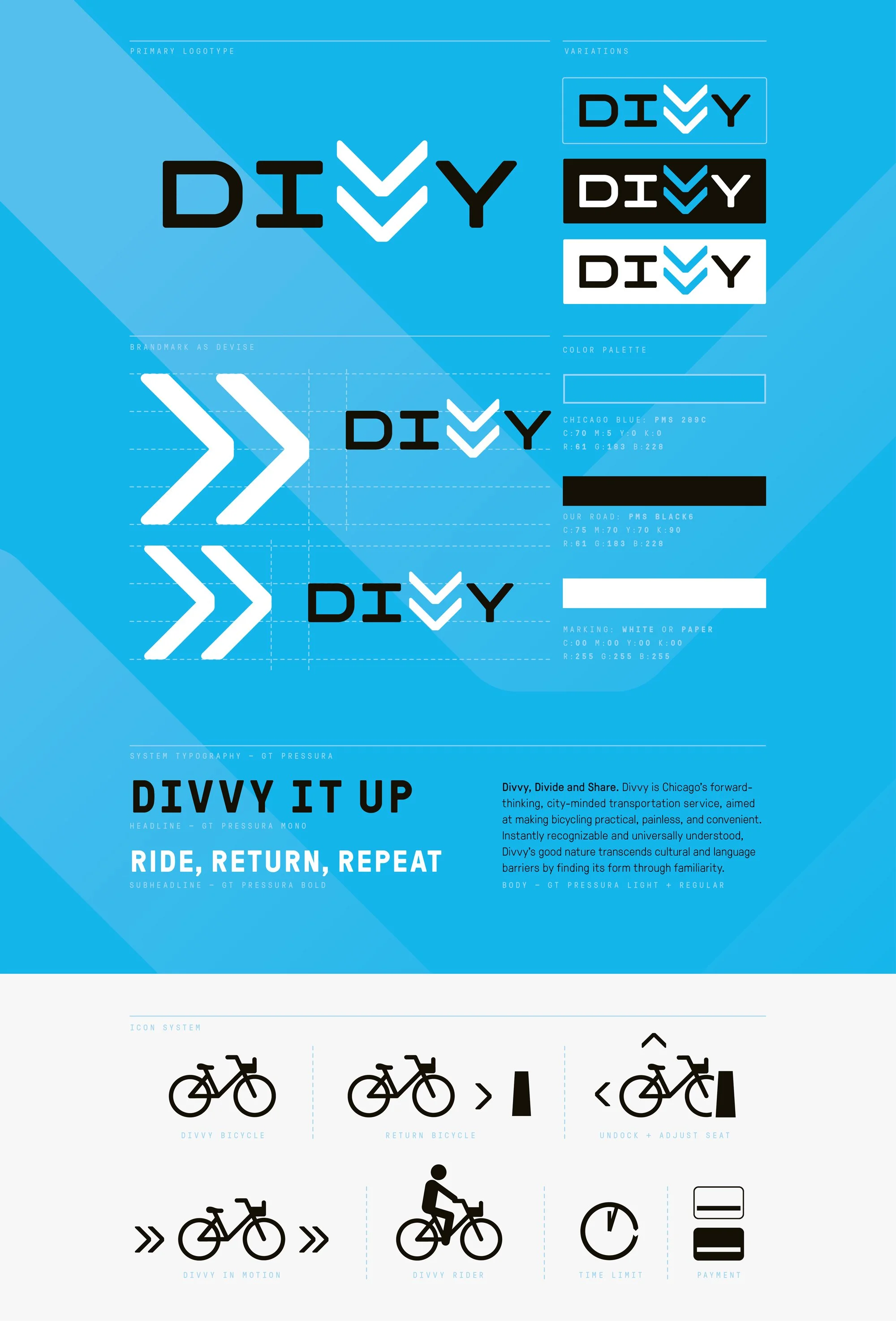
A custom logotype began to form around the double‑V ligature, a typographic glyph used to indicate motion, and a street symbol used worldwide to demarcate bike lanes. Each letter of the name is built using right angles and geometric curves, a nod to Chicago’s infamous grid. The logotype alone conveys comfort and familiarity, but the system as a whole takes Divvy to a new level of urban distinction.
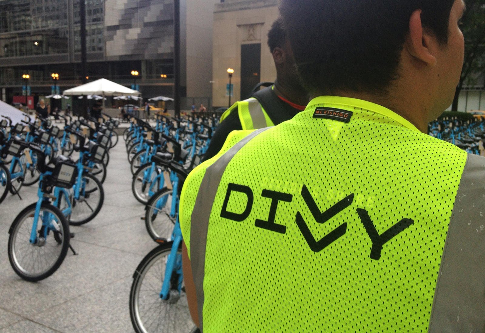
Within three weeks, Divvy was the busiest bike share in the world. Launched with 750 bikes at 75 stations, by 2015, Chicago had 4,760 bikes at 476 stations. Divvy now lives across the city, a part of our cultural fabric. It’s democratic, engaging and empowering, paving the way for new riders every day.