Green Line Performing Arts Center
University of Chicago’s Arts + Public Life reached out to Firebelly to collaborate on Green Line Performing Arts Center, a black box theater incubator and performance space. With construction, lead by Morris Architects Planners, well underway, we worked to develop a visual identity that was inspired by the striking architecture and surrounding environment.


Project Summary
Washington Park has a rich history of Black creative excellence. The south-side Chicago neighborhood has inspired great 20th-century works of art like Raisin in the Sun and Native Son. In the late 2000s, University of Chicago and Theaster Gates formed a vision to revitalize the area with new shared spaces to gather and support artistic expression.
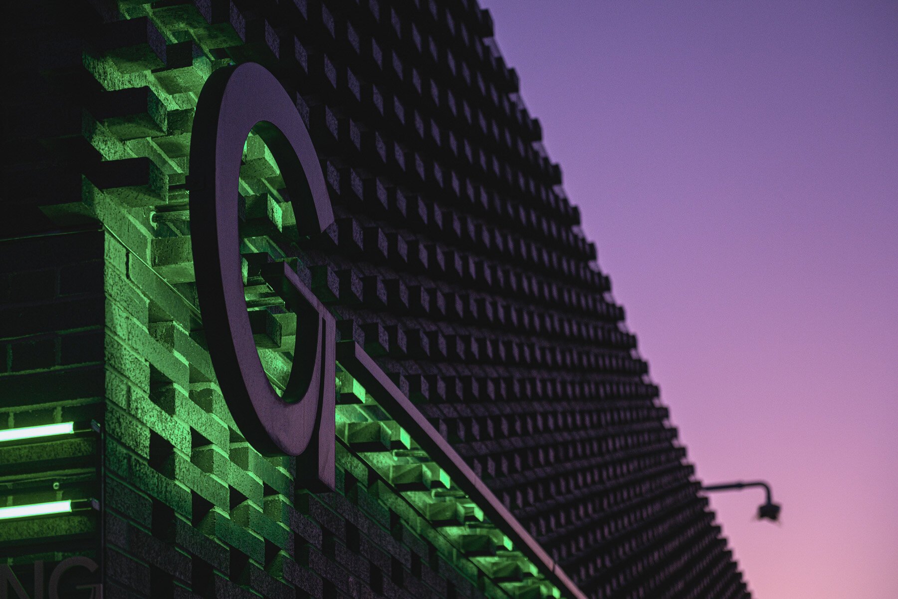
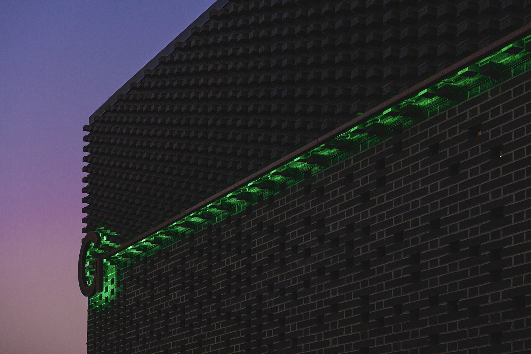
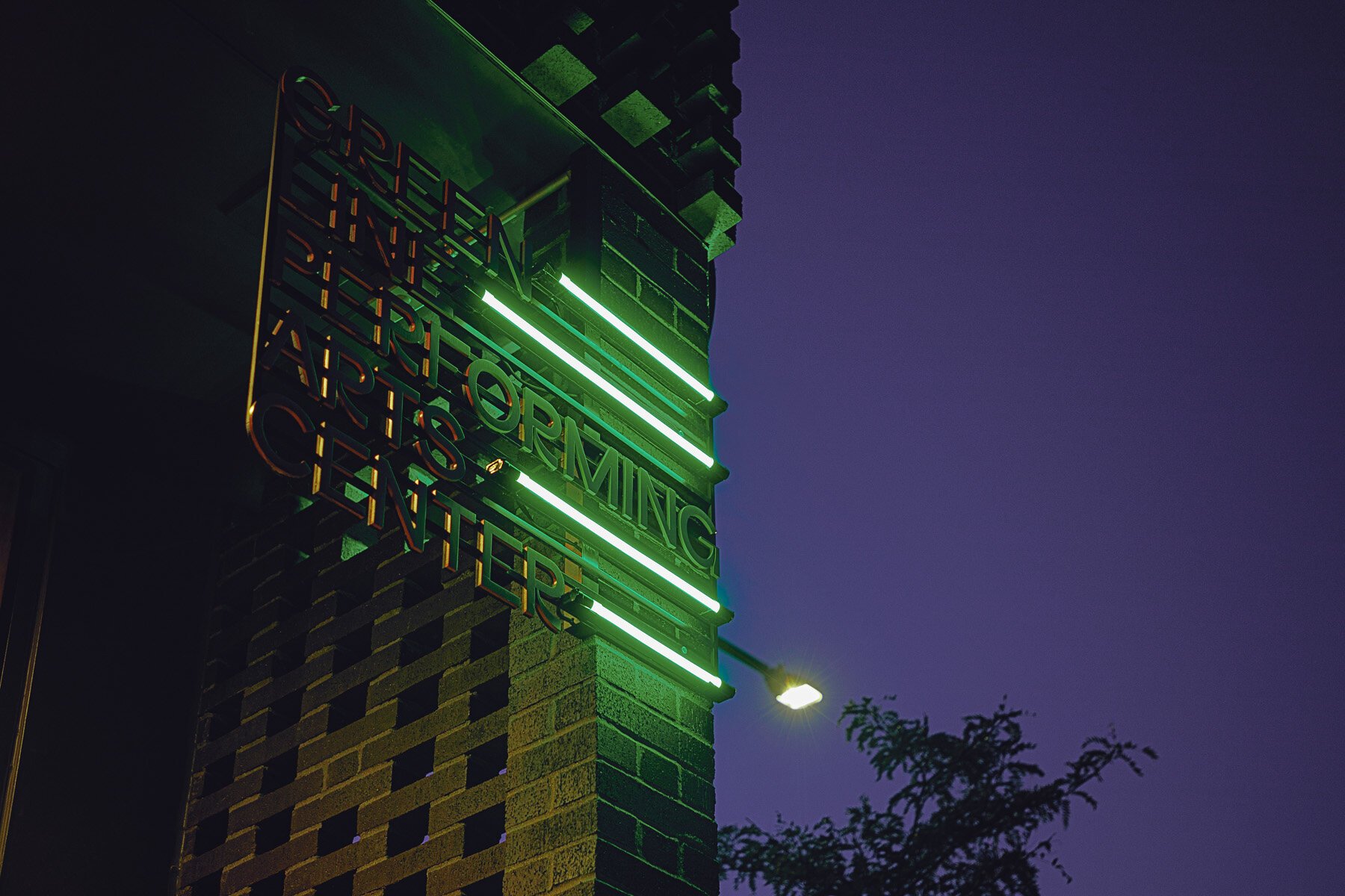
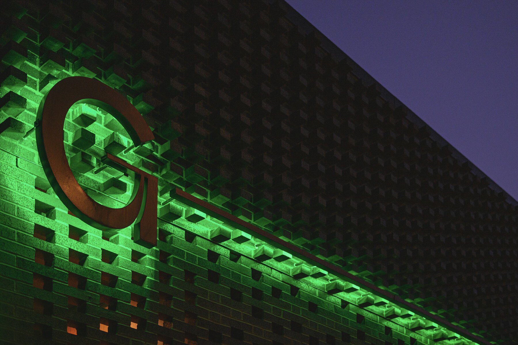
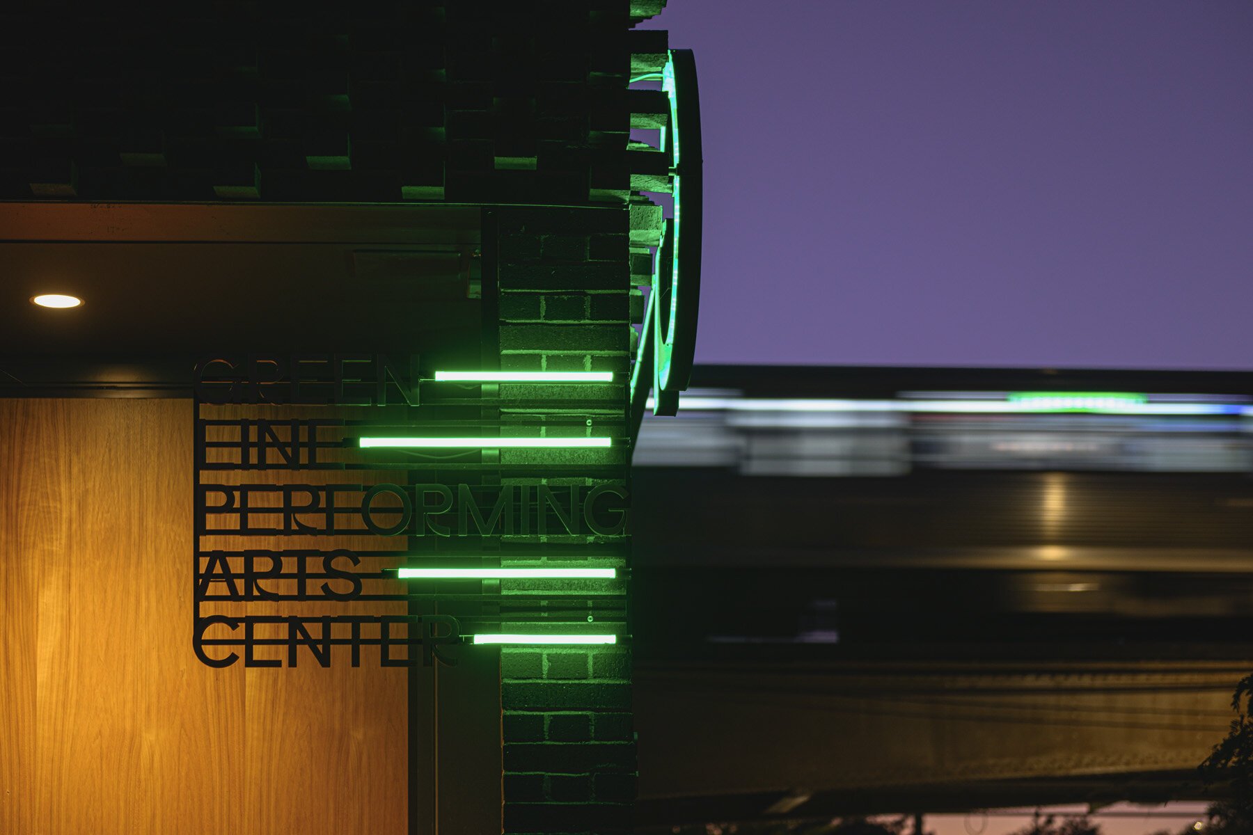
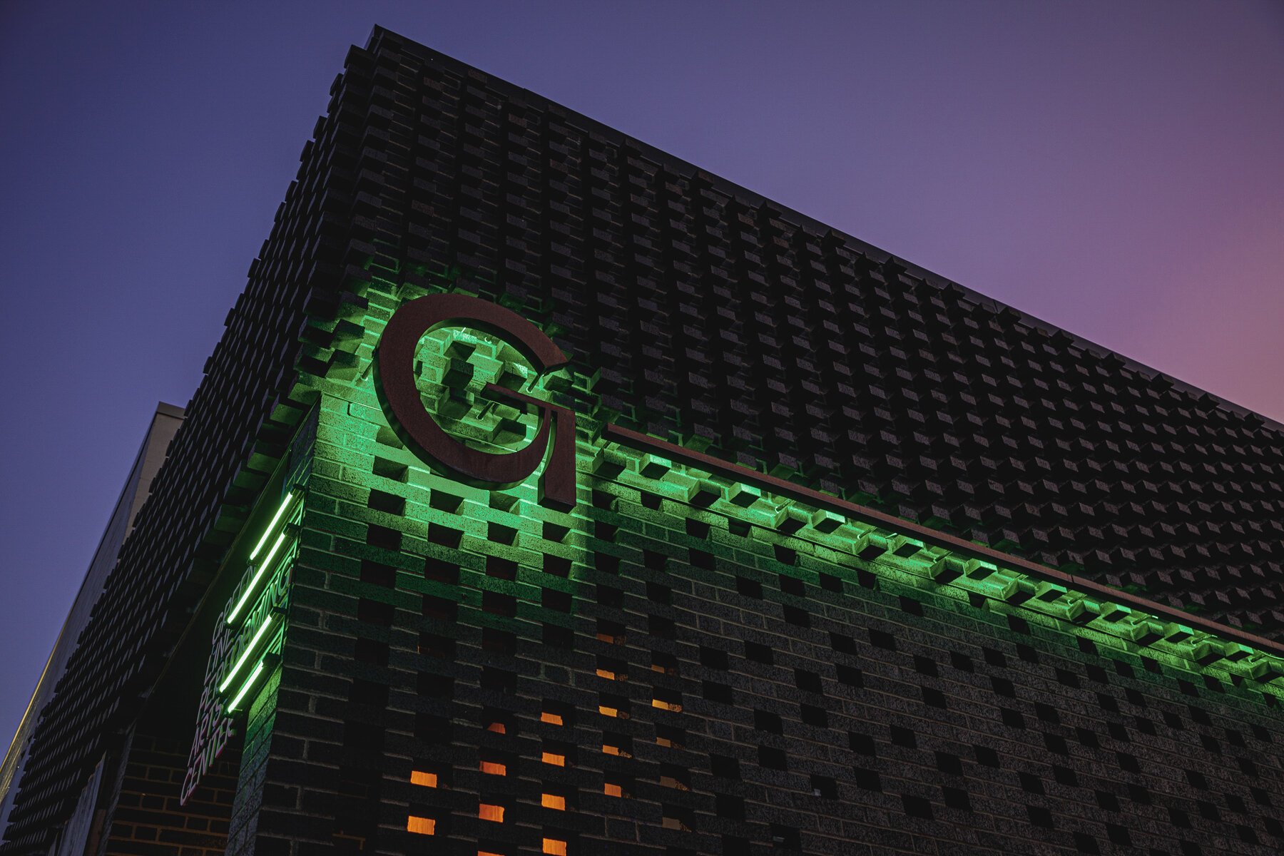
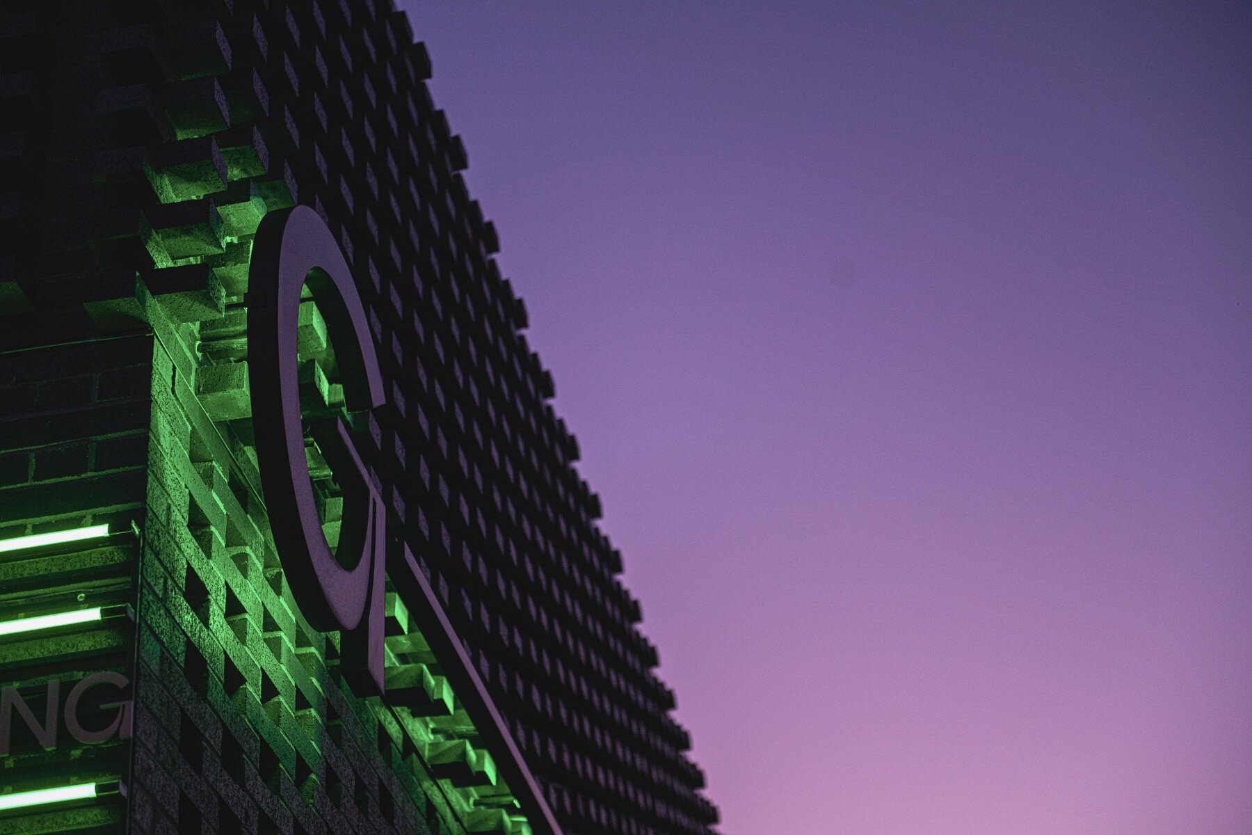
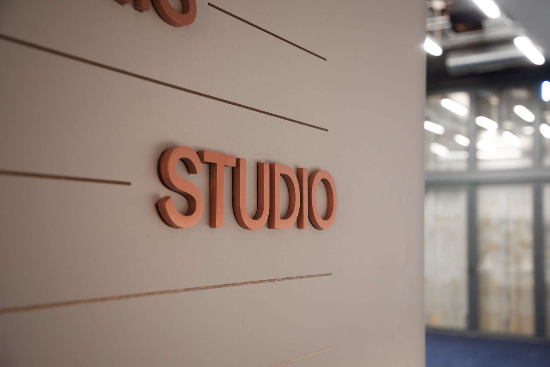
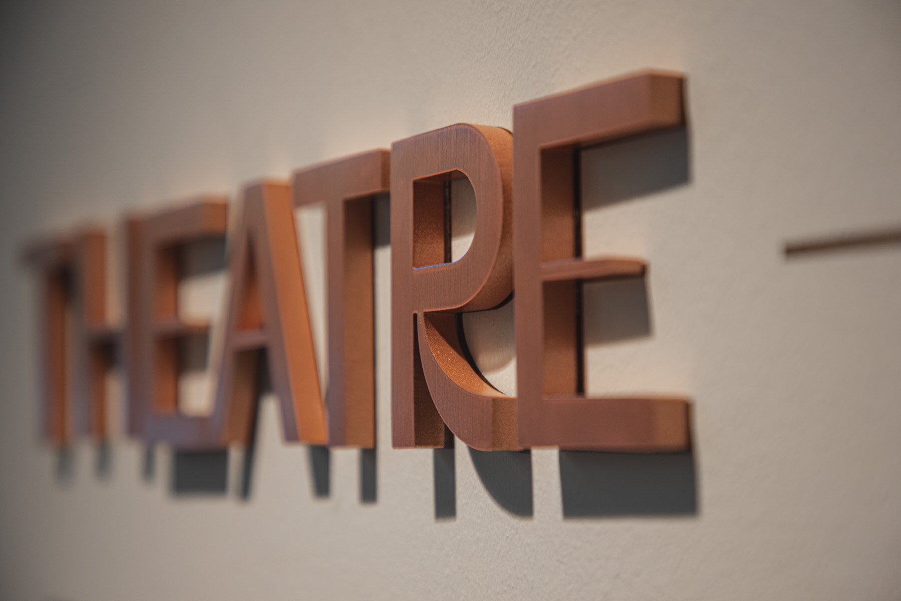
For Green Line, the team focused on conveying energy and movement. After establishing core letterforms, we developed three distinct logos that give the theater loads of options. The Lettermark is reduced to a single G and used for high awareness moments like building signage, while the modular Framing Wordmark establishes a clear structure for easy layout construction.
From our logos we developed a full custom typeface: GL Grotesk. It echoes the horizontal motion of the namesake train through stacked, repeating lines. Setting the voice and tone for the whole system, it’s highly readable and features informal, quirky details; welcoming the community with open arms.
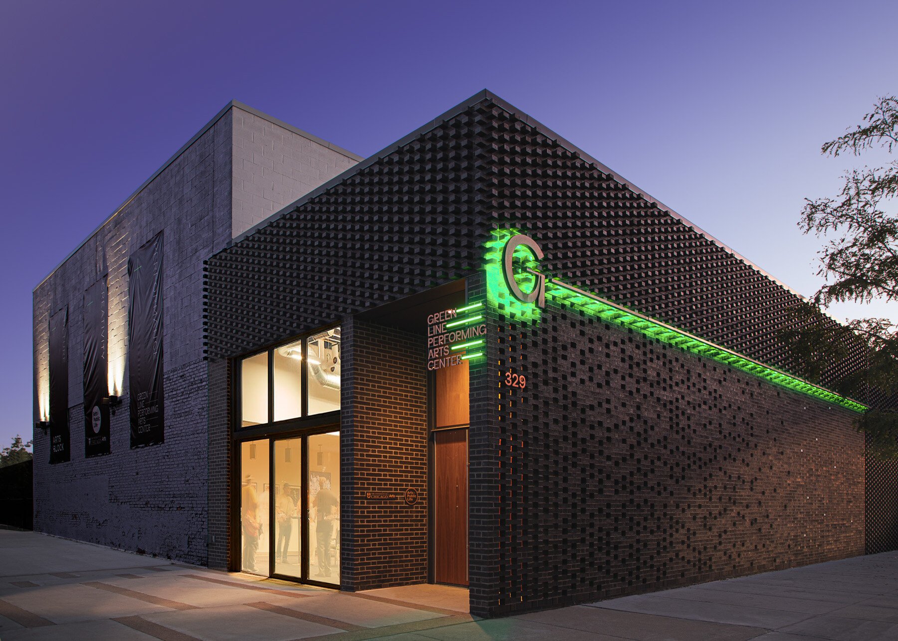
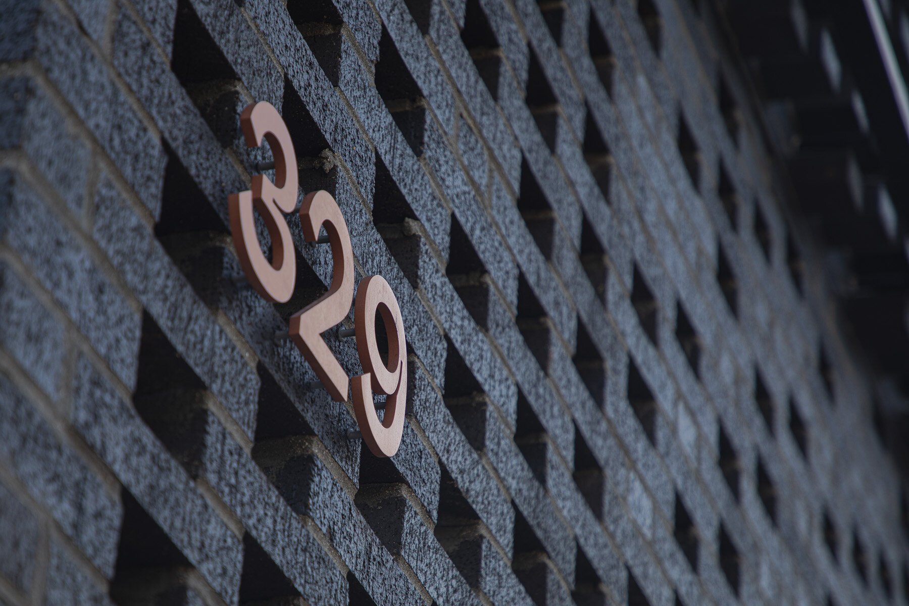
Light and shadow play leading roles both in and outside the theater and inform our layout grids and graphic devices. Glass blocks enable light to enter the theater during the day and exit at night, enticing folks on either side of the walls. The extruding bricks on the outer façade create dynamic shadow patterns throughout the day. We used both of these visual effects to create a diverse family of motion-friendly patterns.
The identity came to full, illuminated life as signage at the corner of the theatre’s entrance and street-facing brick screen exterior. Developed in collaboration with long-time partner Rightway Signs, the Lettermark runs the full length of the building, pointing to the adjacent Green Line L tracks, while the Wordmark neatly stacks perpendicularly. Both forms work together, guiding the way, connecting community and creativity.
A project completed at Firebelly in collaboration with Ross Burwell.