No. 9 Walton
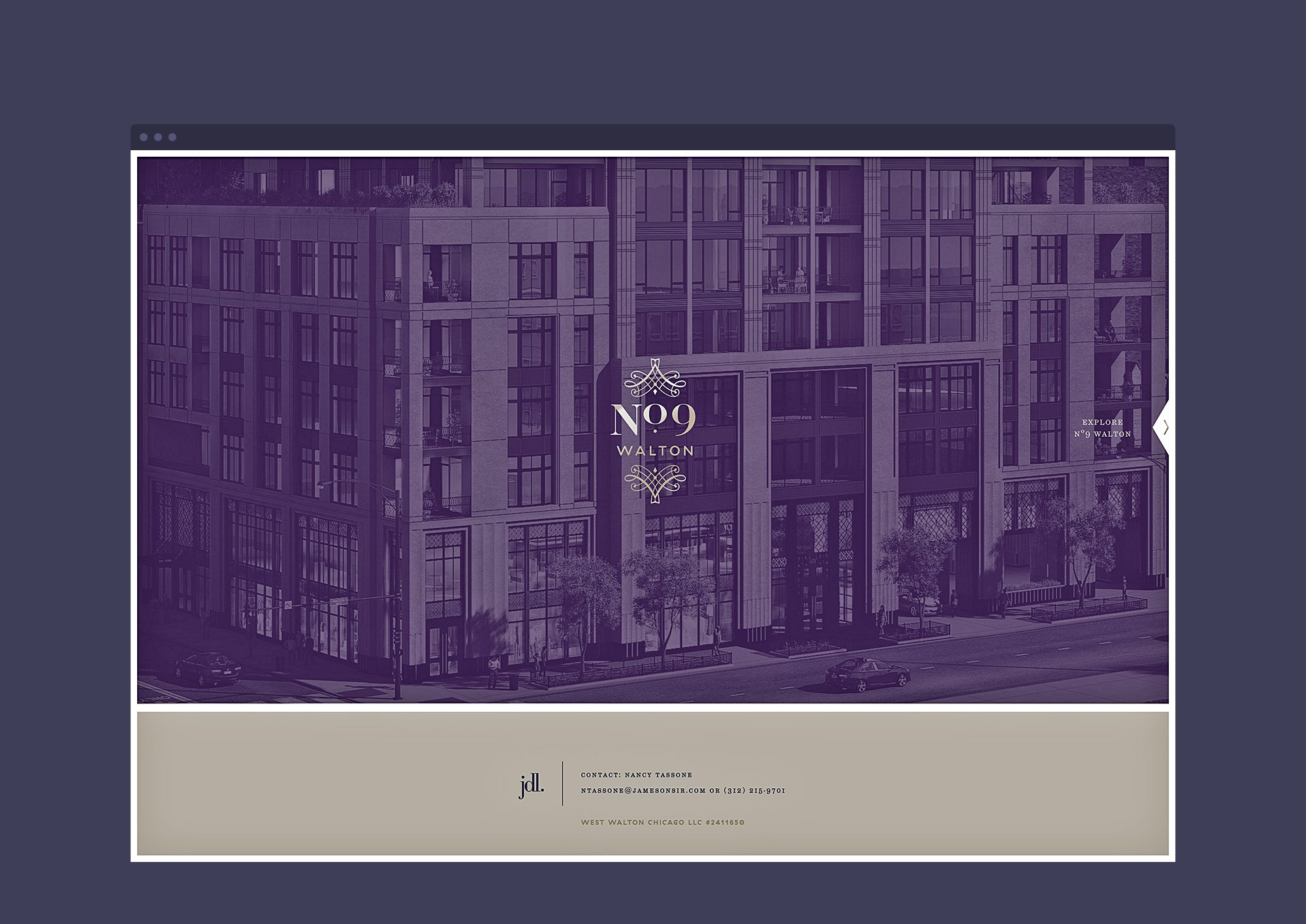
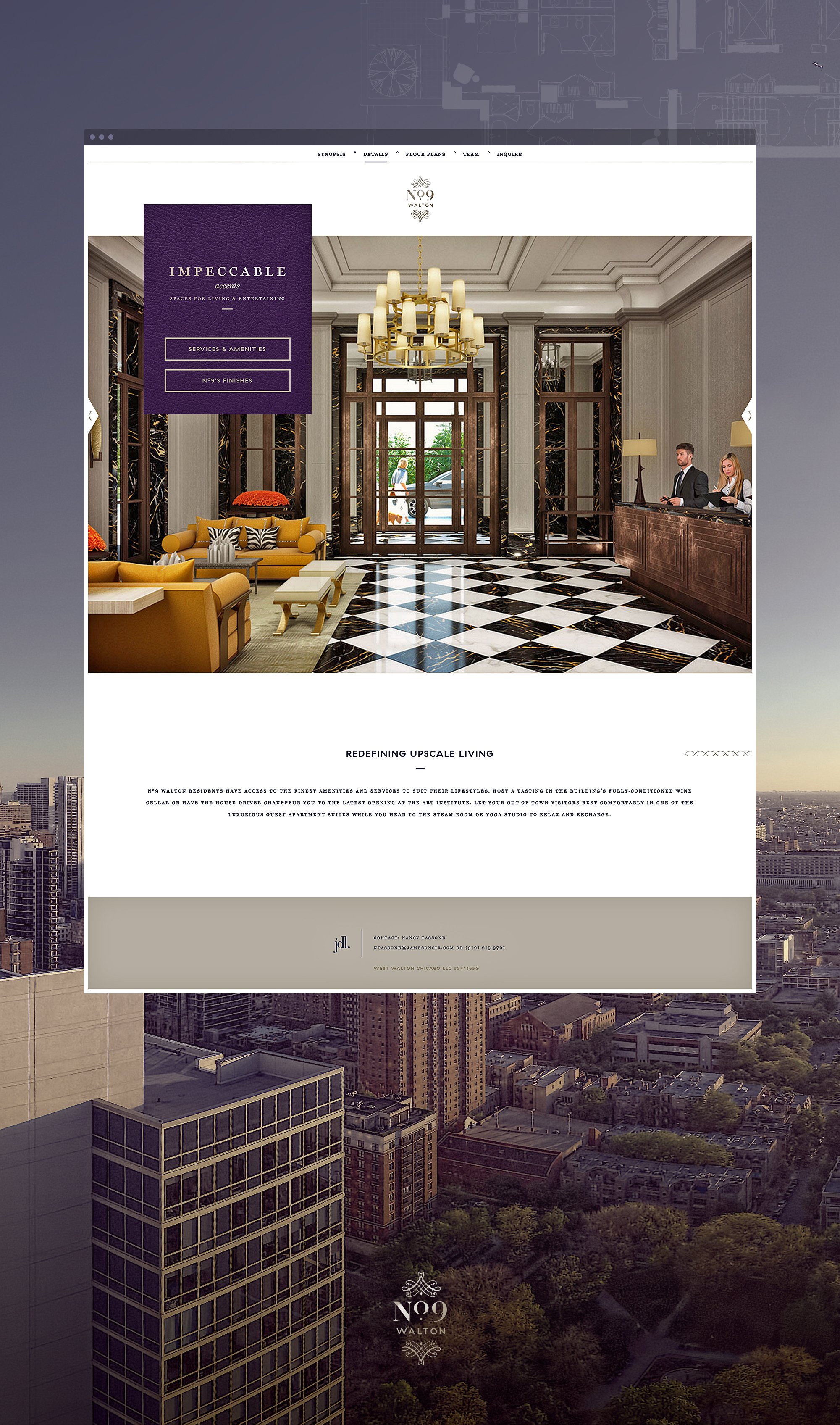
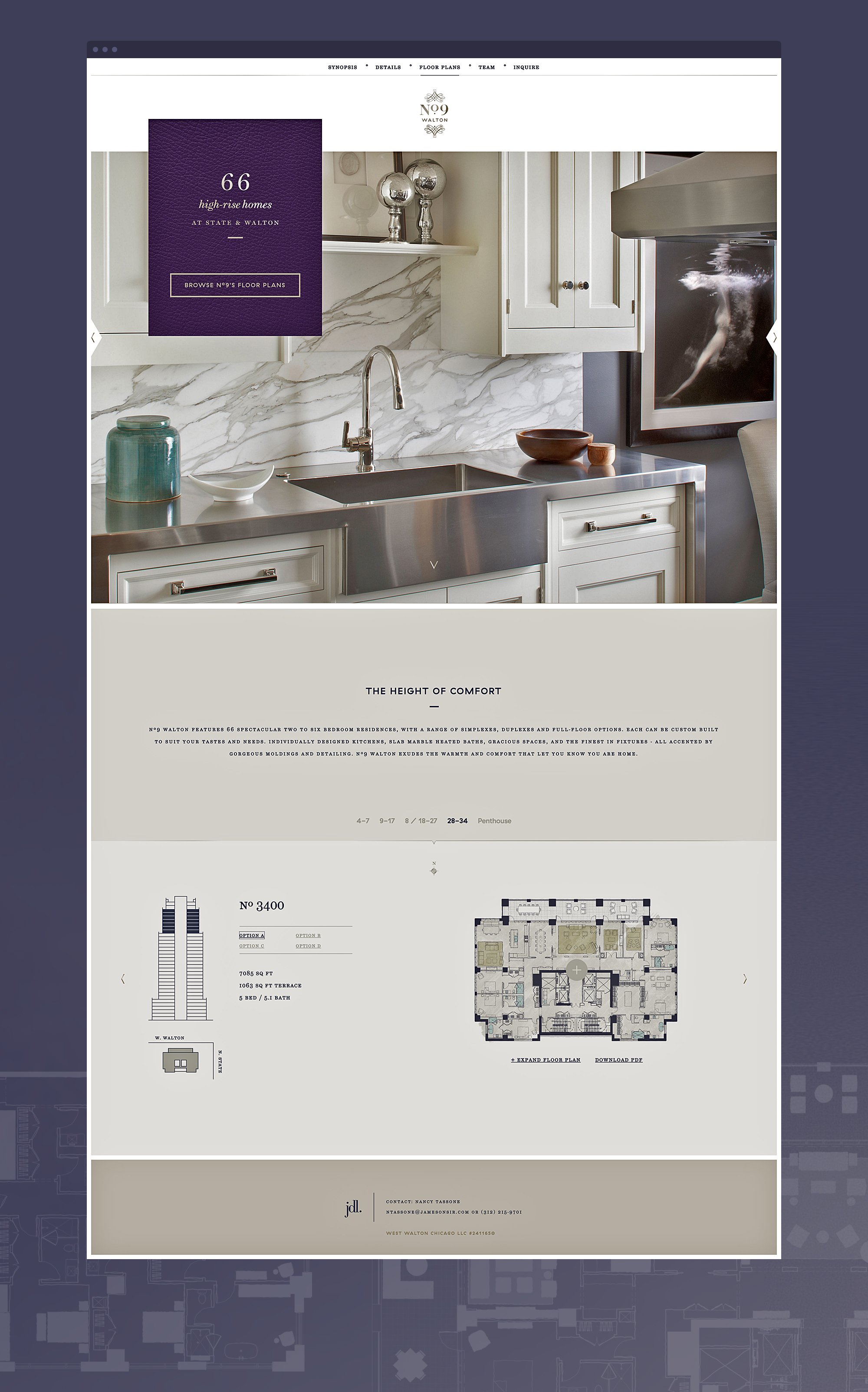
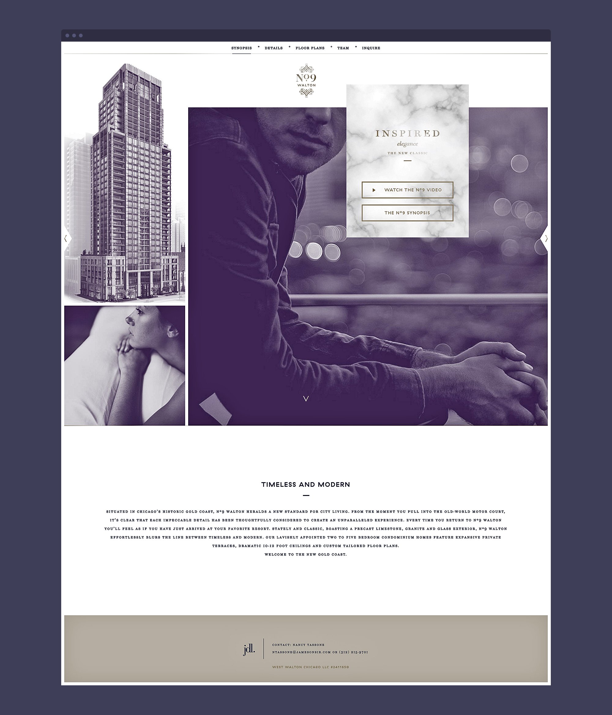
The stately high rise was designed to set a new standard for residential buildings in Chicago’s tiny Gold Coast. Each unit presented an opportunity for bespoke living, inviting residents to customize every fixture and finish—even floorplans.












Project Summary
JDL, the company behind the building, came to us with their vision and a logo. What they needed next was a multi-sensory story, a way to sell prospects on a place that did not yet exist. And in a high-end market flooded with superlatives, they didn’t want to use the word luxury. They wanted to embody it.
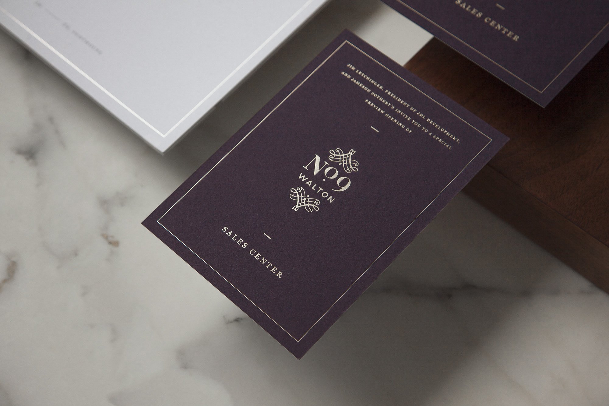
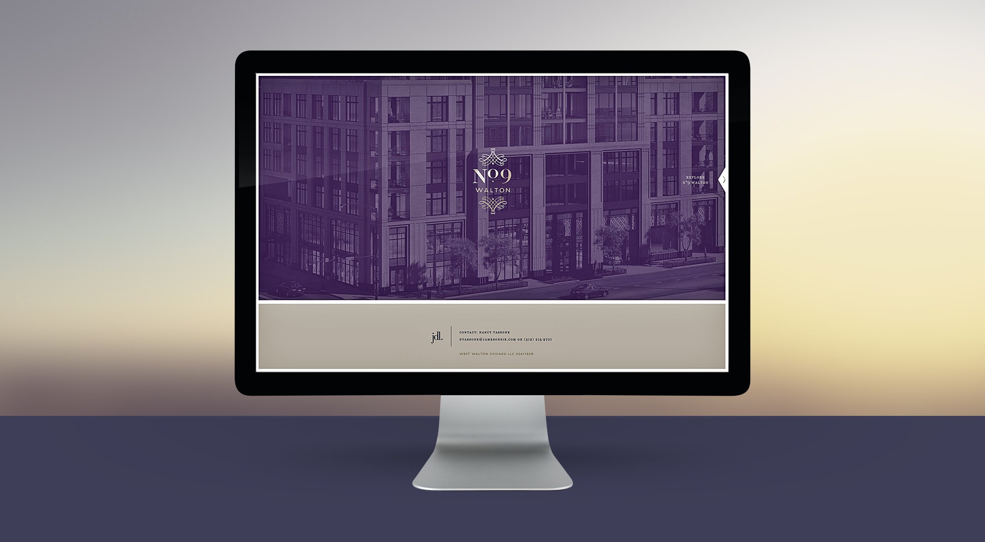
We began by refining the logo and developing a sophisticated visual and material language. Silky purples, cool marbles and gold accents—enriched only further by prodigious white space—strike the right balance between dreamy and regal.
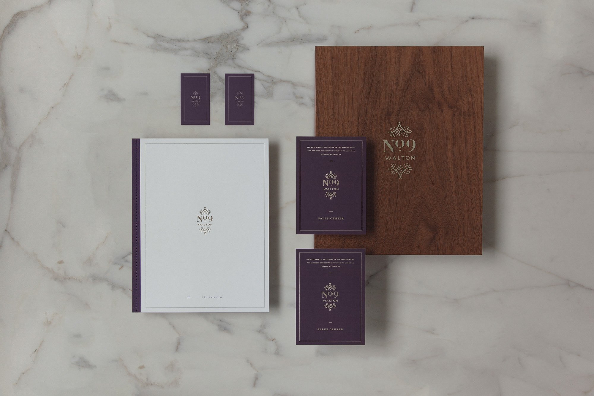
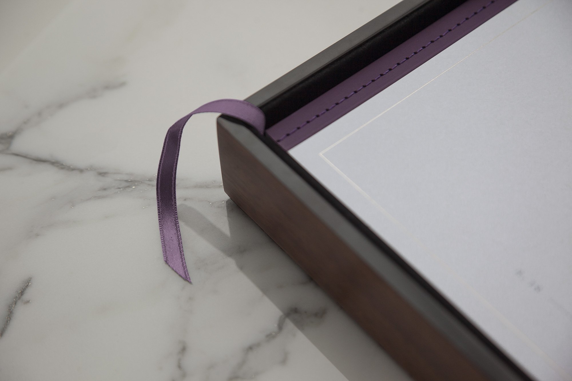
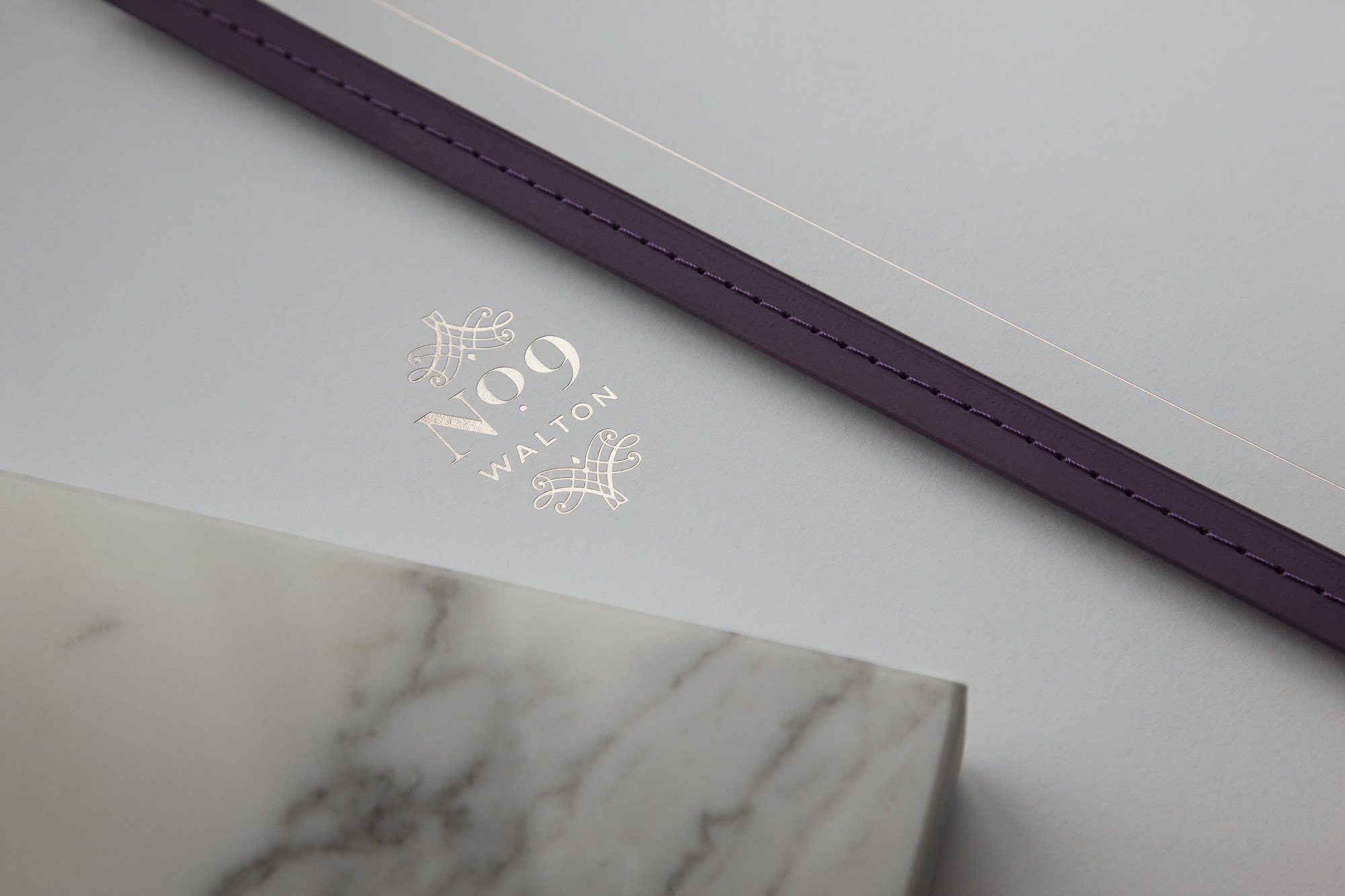
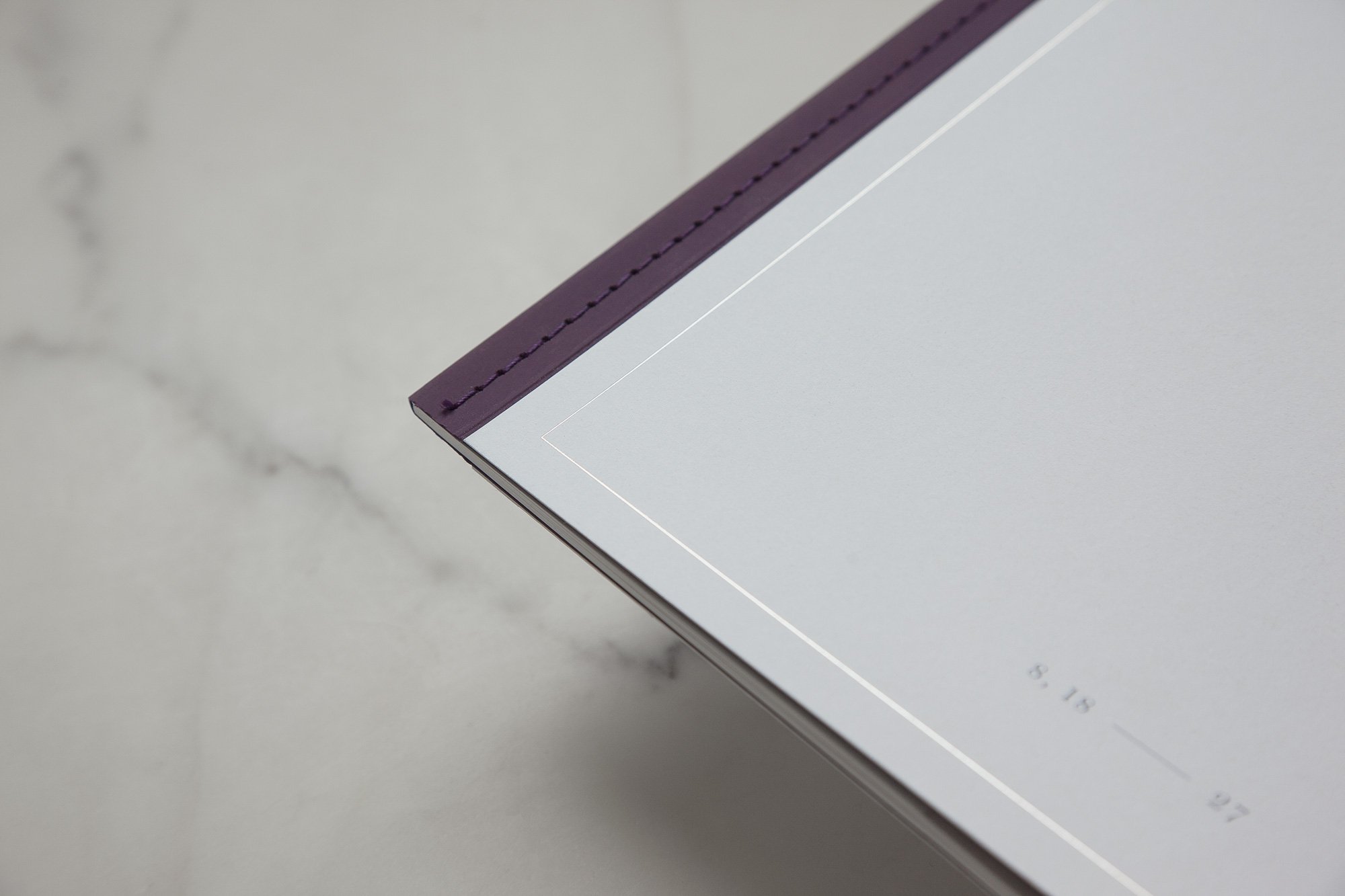
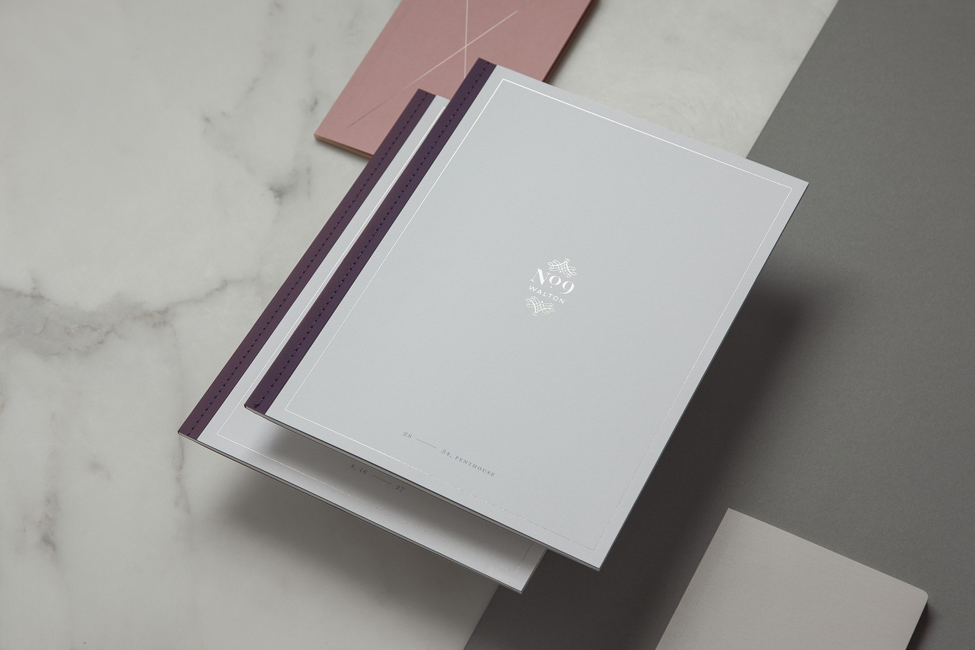
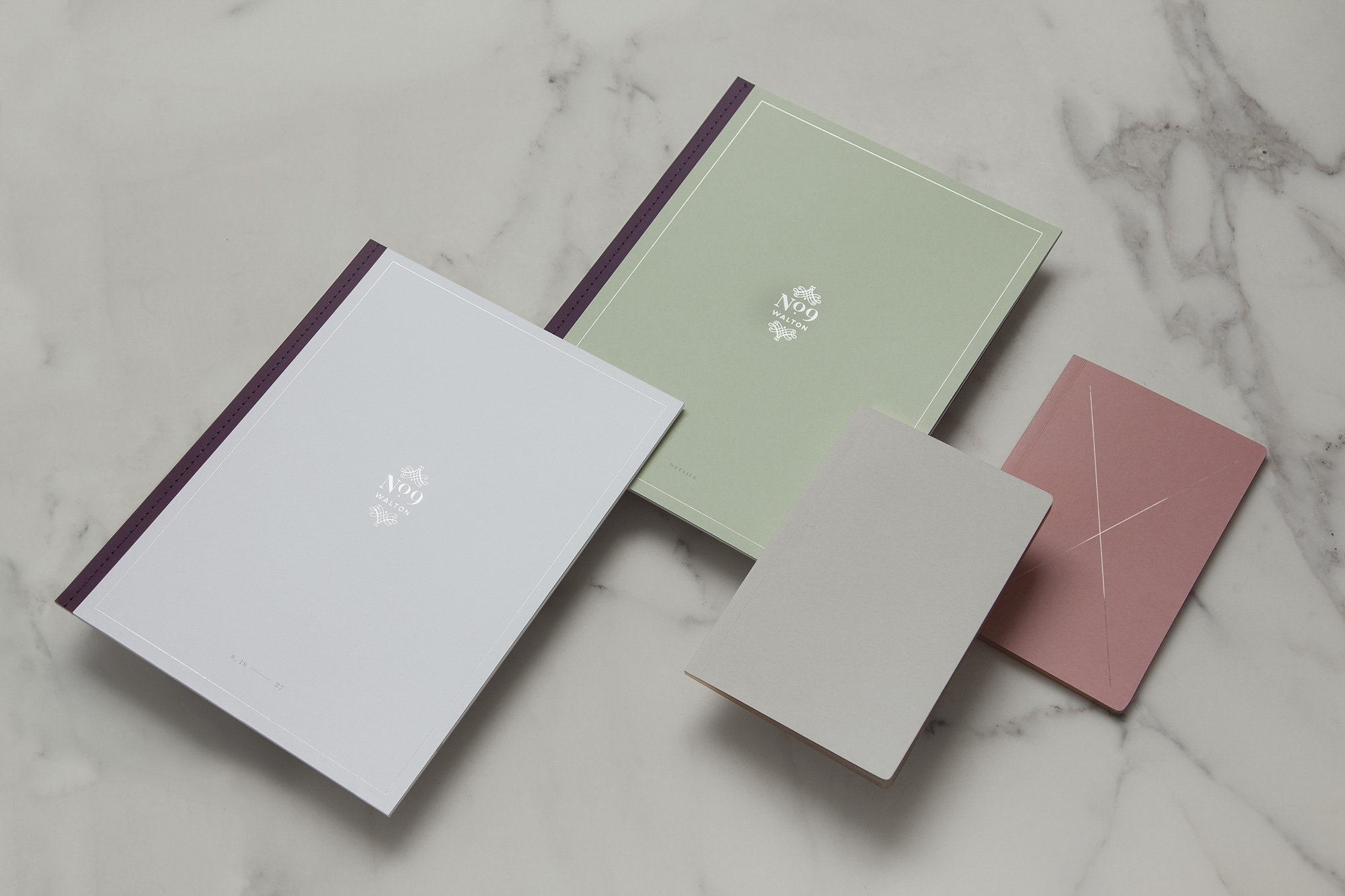
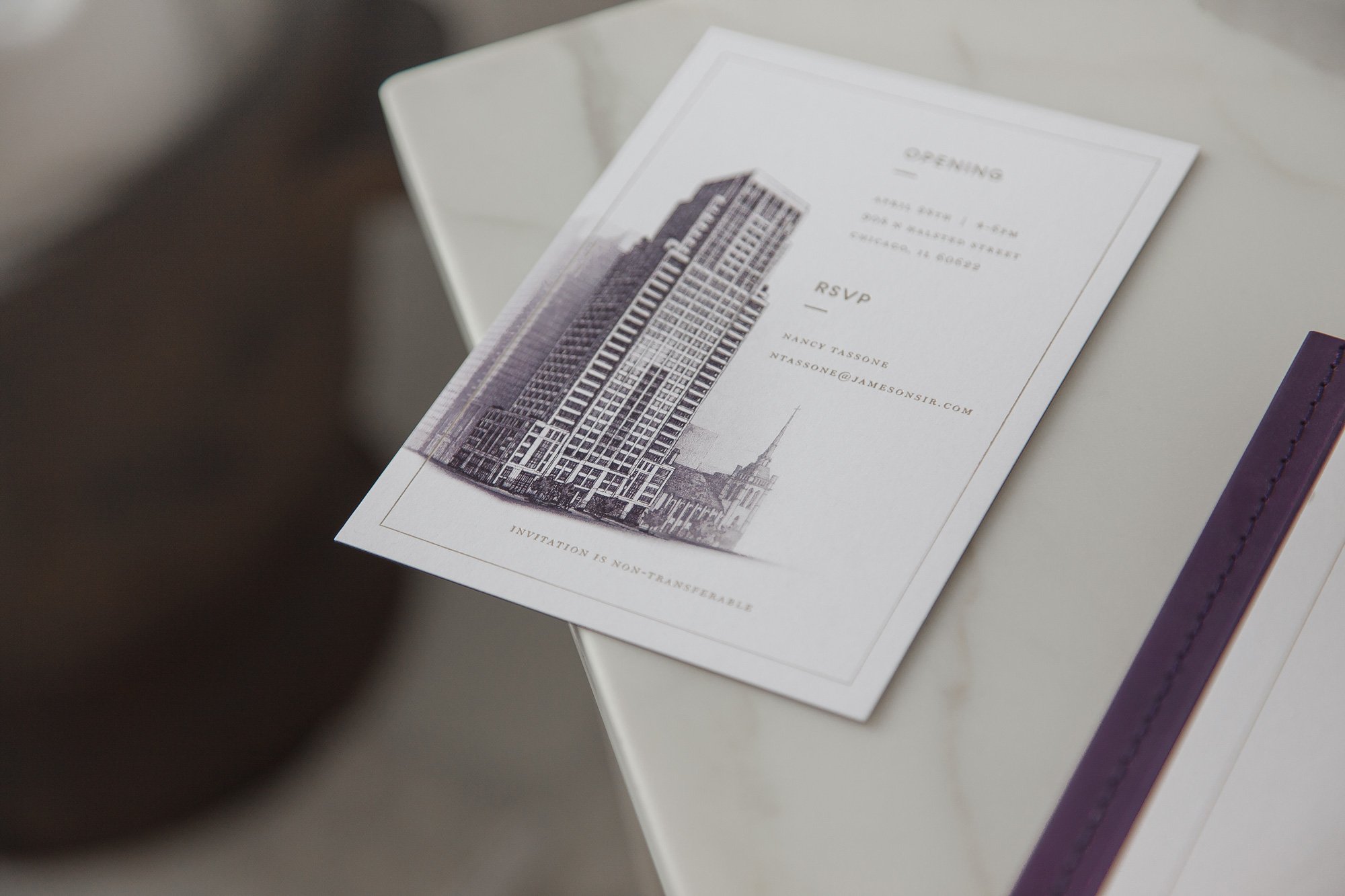
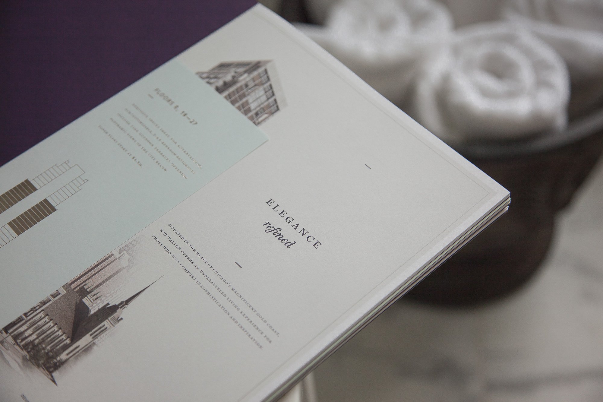
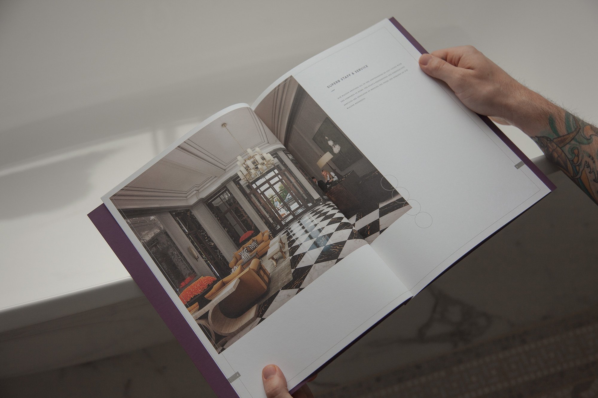
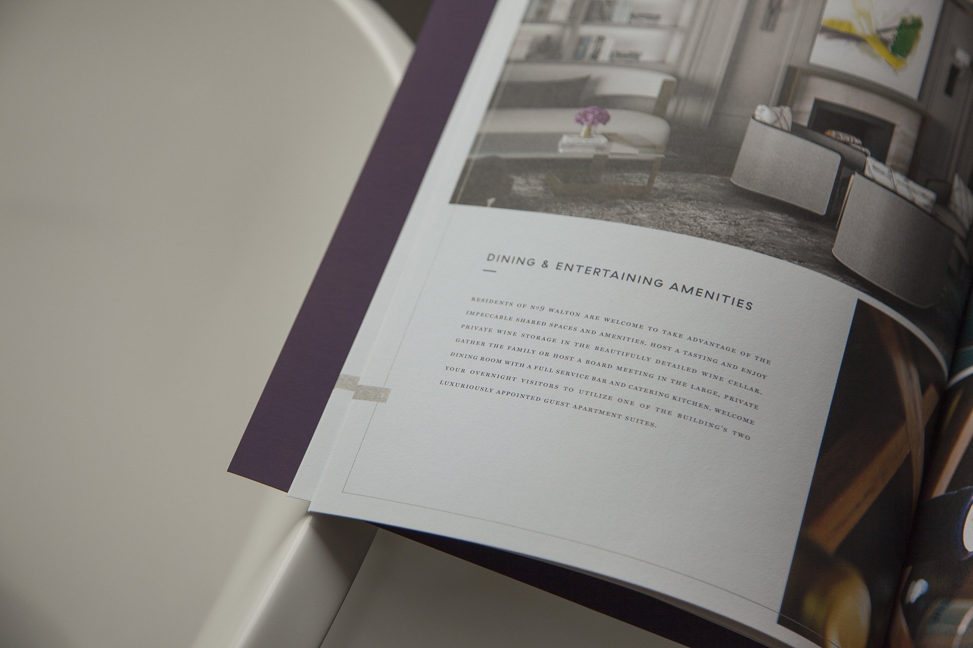
Our first undertaking: a sumptuous suite of what can only be called brochures, though they are, in production and presentation, far from ordinary. The set includes five distinctive books, each stitch-bound in purple thread, with duplexed cover stock, gold foil stamping and metallic inks. To house the collection, we commissioned custom mahogany boxes, lined in felt, with a satin pull tab for easy handling.
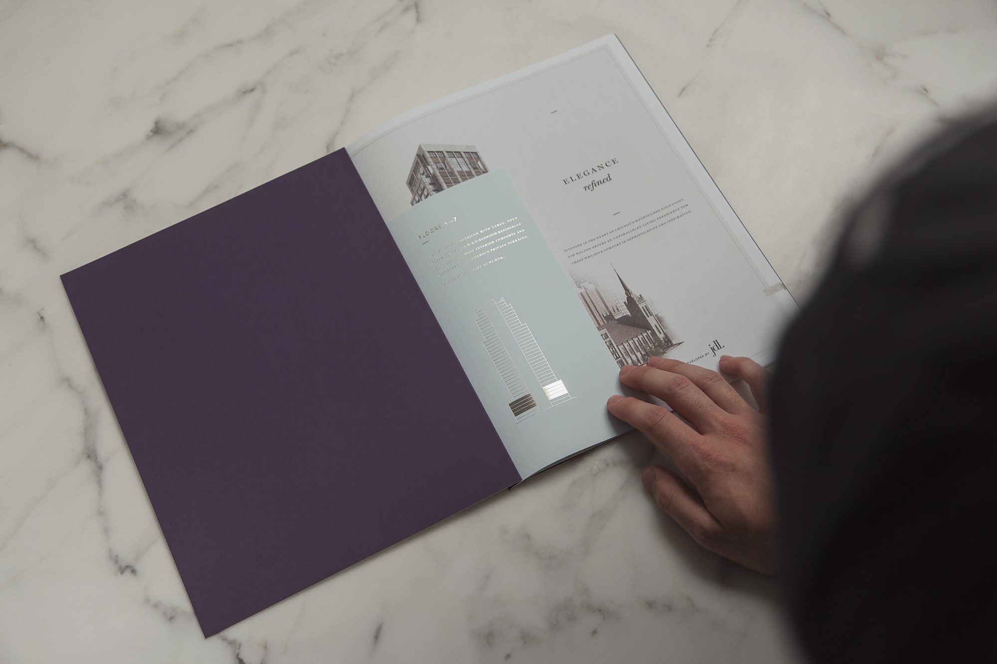
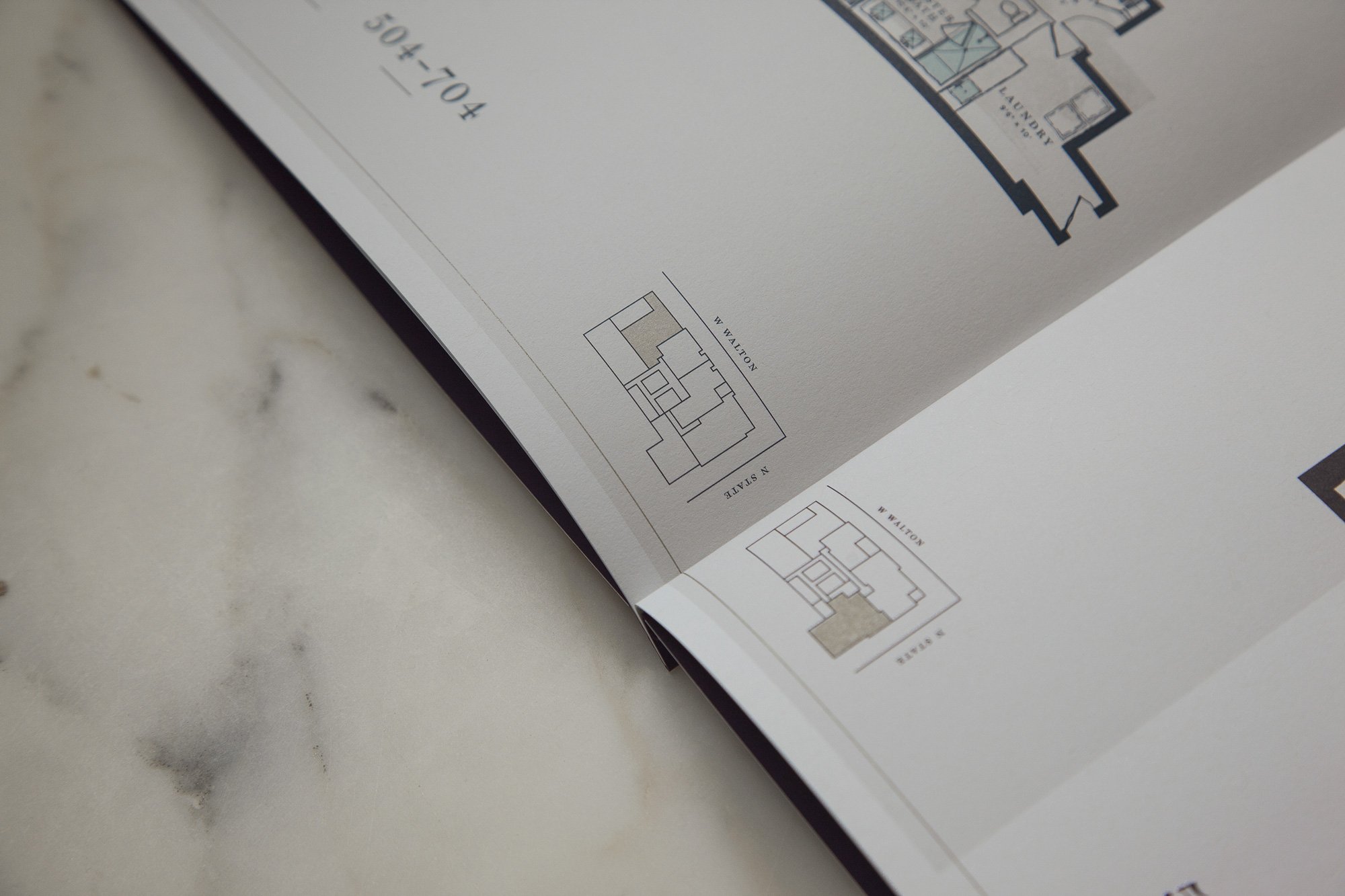
The books offer prospective buyers an exhaustive view of their many options—everything from modular floor plans to the finest finishes. Every one of our design and production decisions was made to capture the grandness of it all: tipped-in intro sheets, printed on slightly more delicate stock, gold foil building diagrams, and four-color printed architectural drawings rendered in watercolor.