Typeforce 4 Book
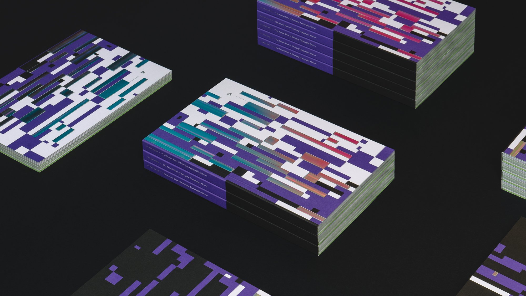
Colorful, interactive, engaging and loud, the Typeforce 4 Exhibition Catalog made every effort to recreate the palpable energy and sense of continuous discovery that made the night so memorable.


Project Summary
Colorful, interactive, engaging and loud, the Typeforce 4 Exhibition Catalog made every effort to recreate the palpable energy and sense of continuous discovery that made the night so memorable.
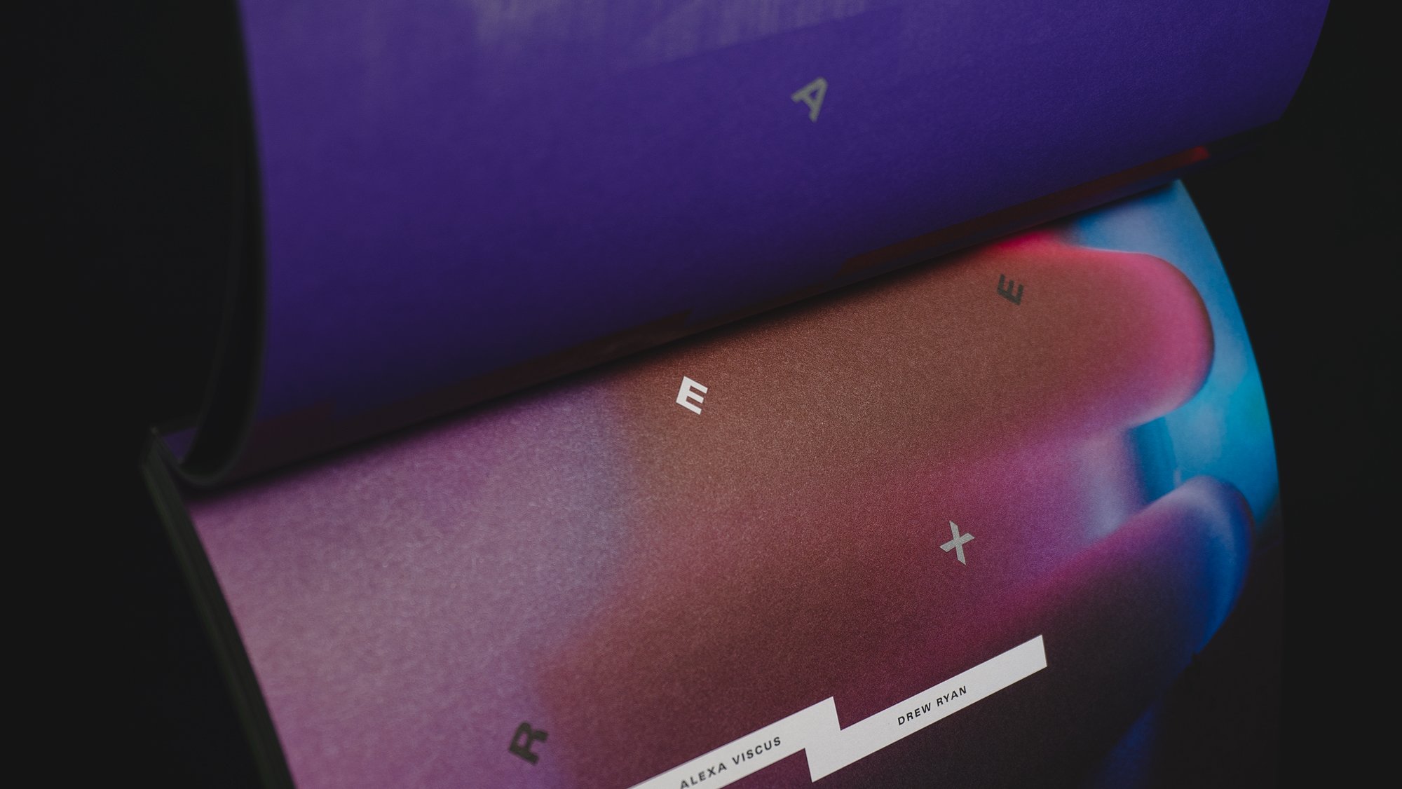
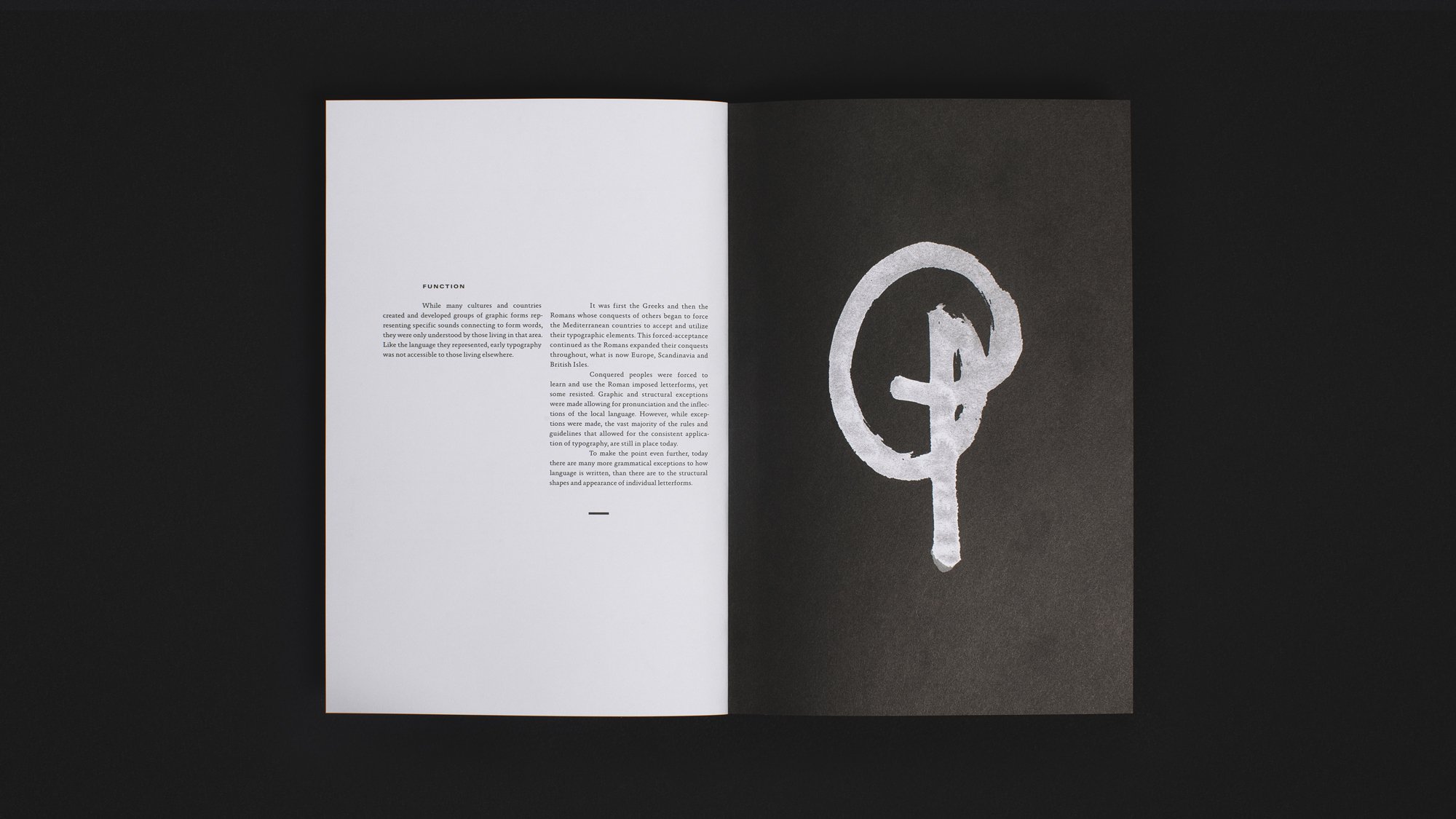
Collaborating with Joseph Michael Essex, we asked him to draft a primer on typography as a foreword. The book begins in usual format, users read left-to-right turning pages right-to-left. As front matter tapers, users are provided clues to re-orient the volume's format. This book, inspired by scrolling collections, responsive layouts and shared, divergent experiences attempts to advance traditional page format constraints through layouts and layering more often experienced in digital environments.
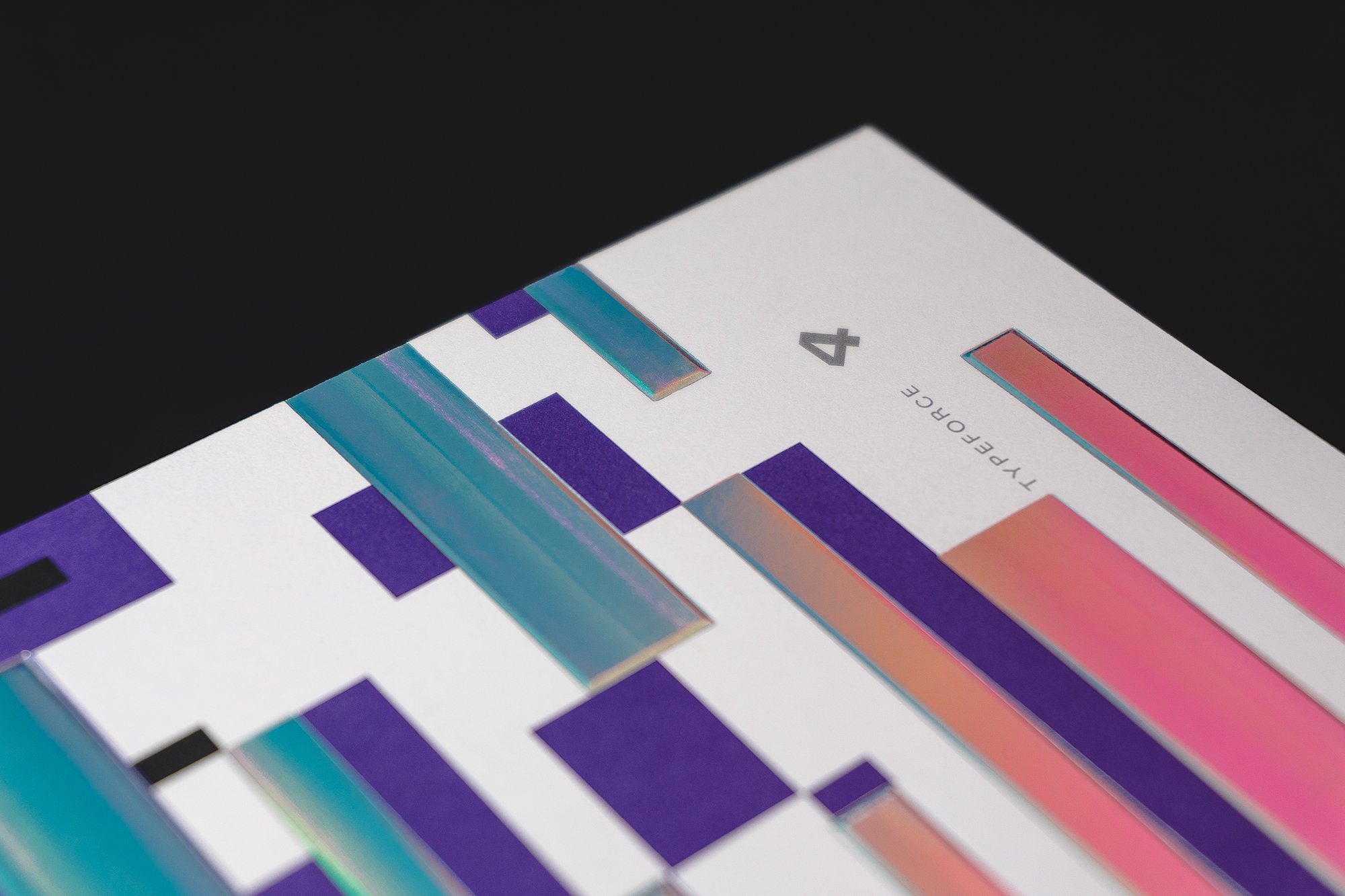
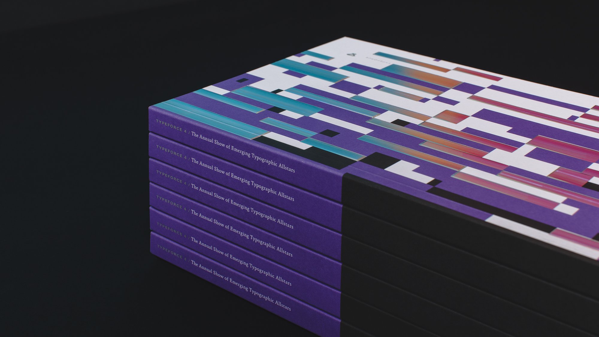
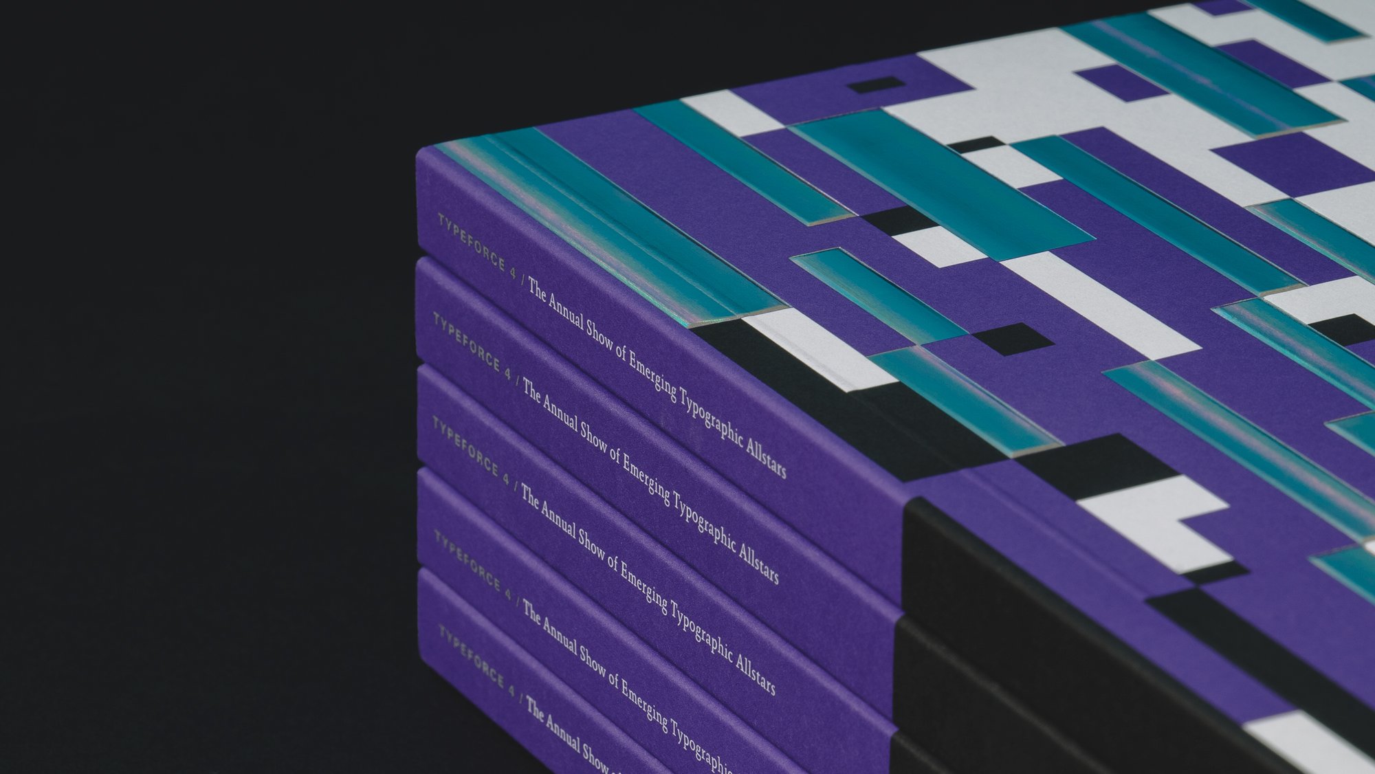
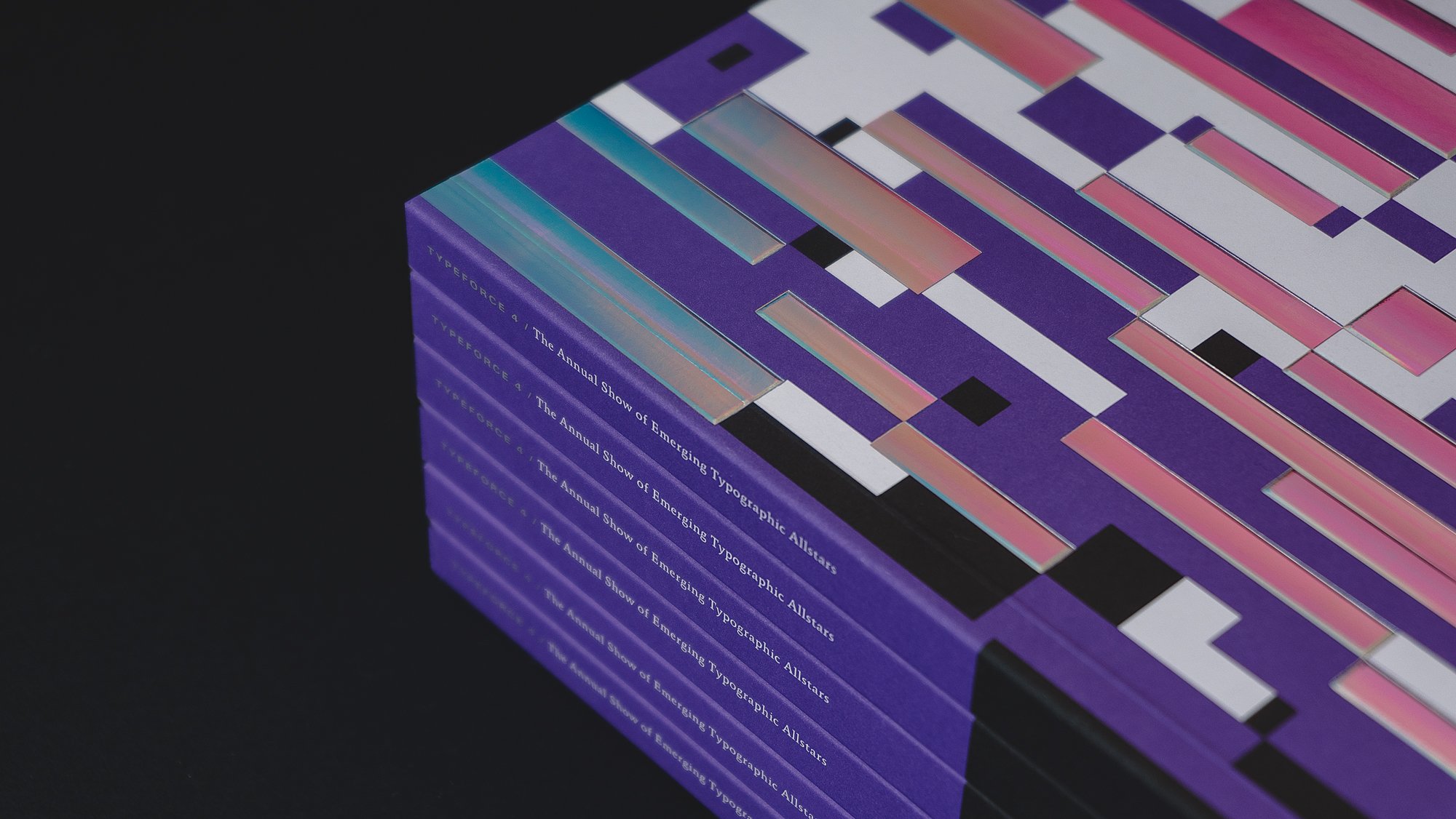
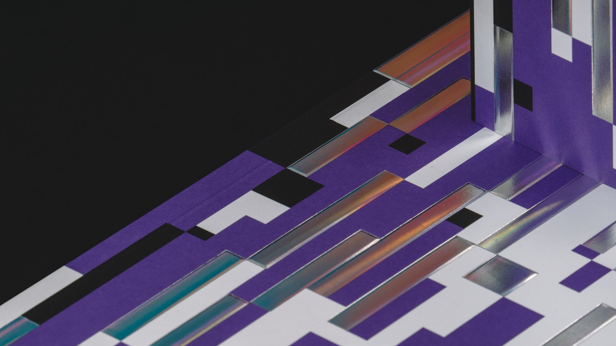
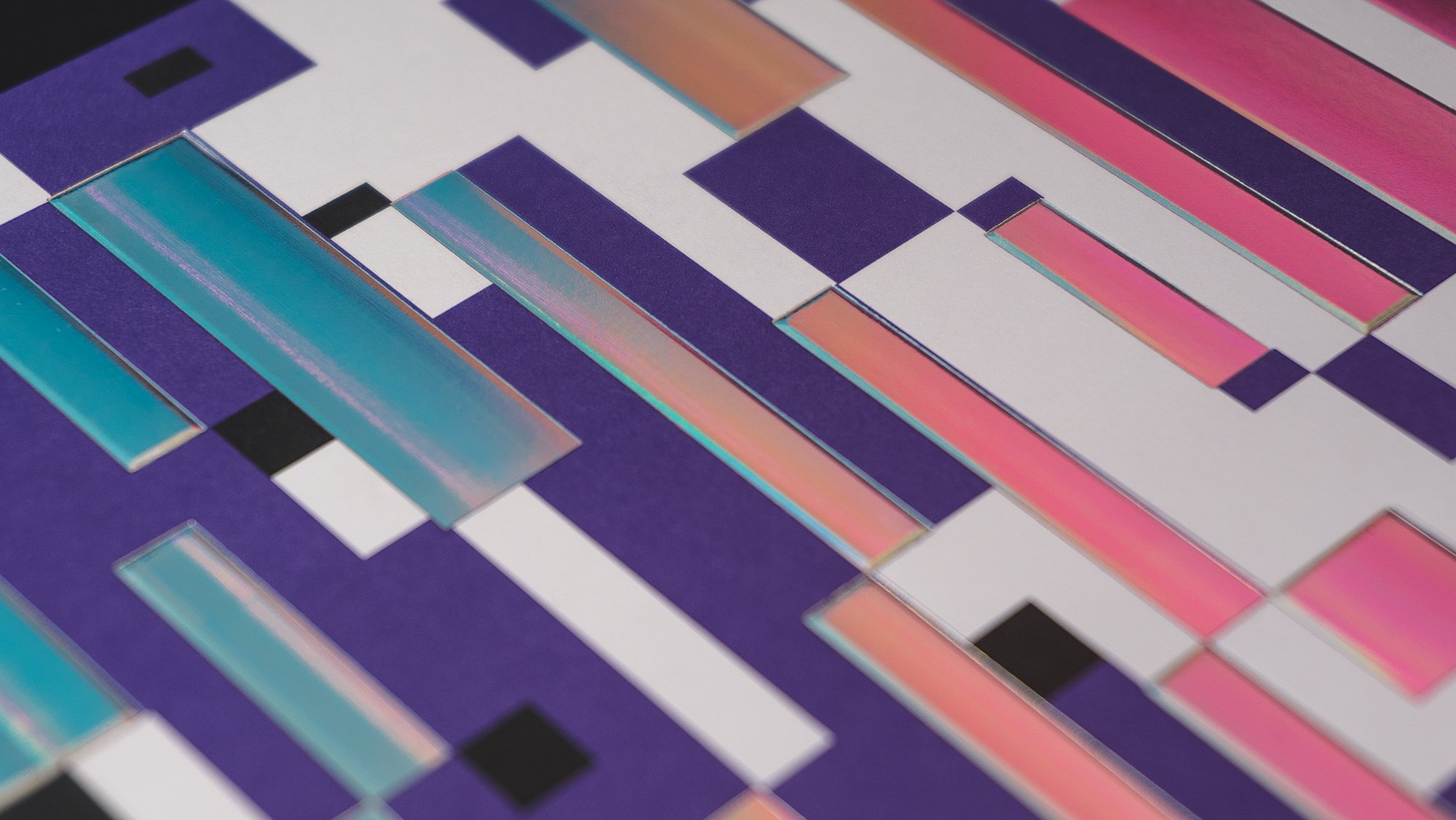
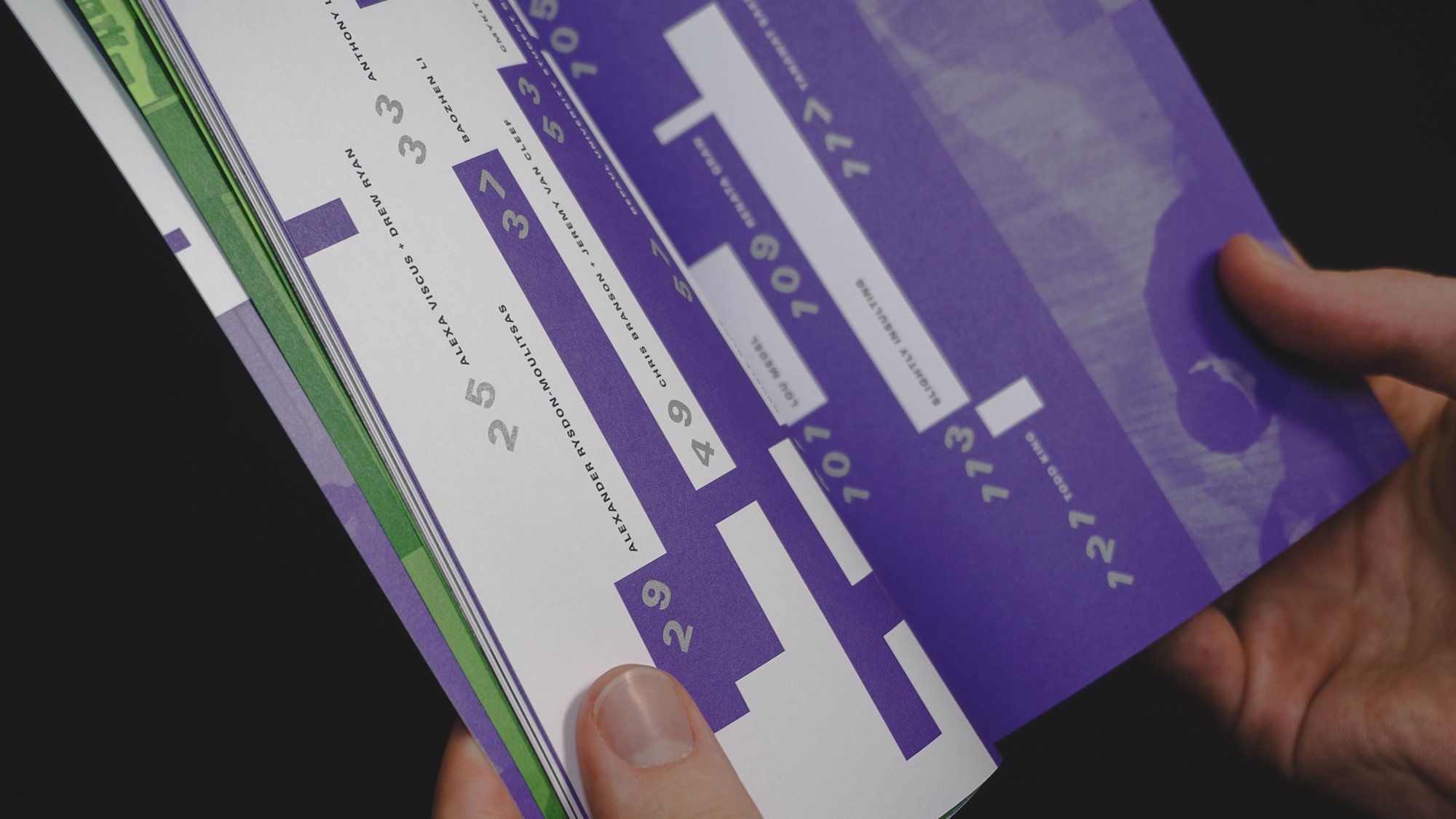
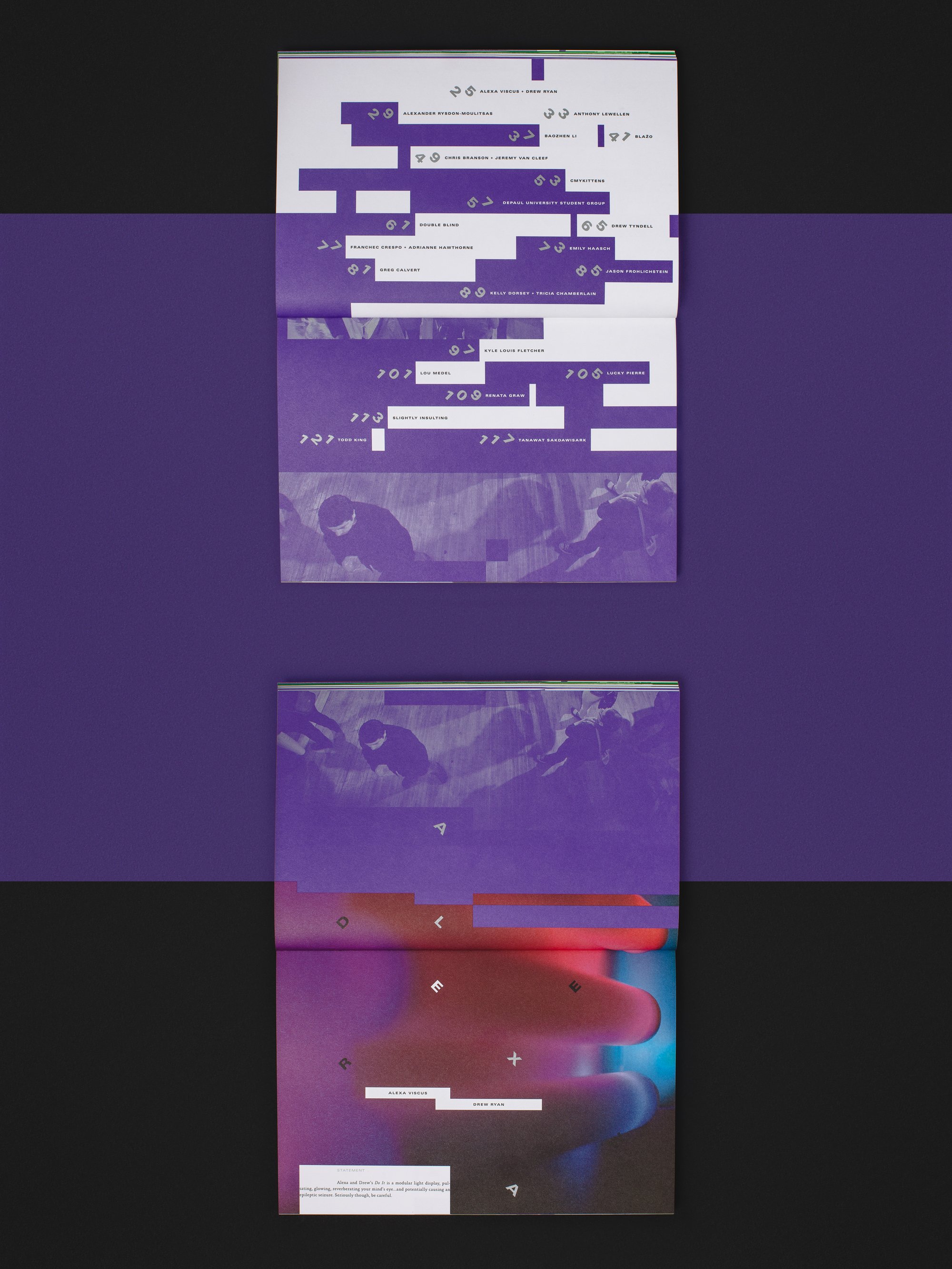
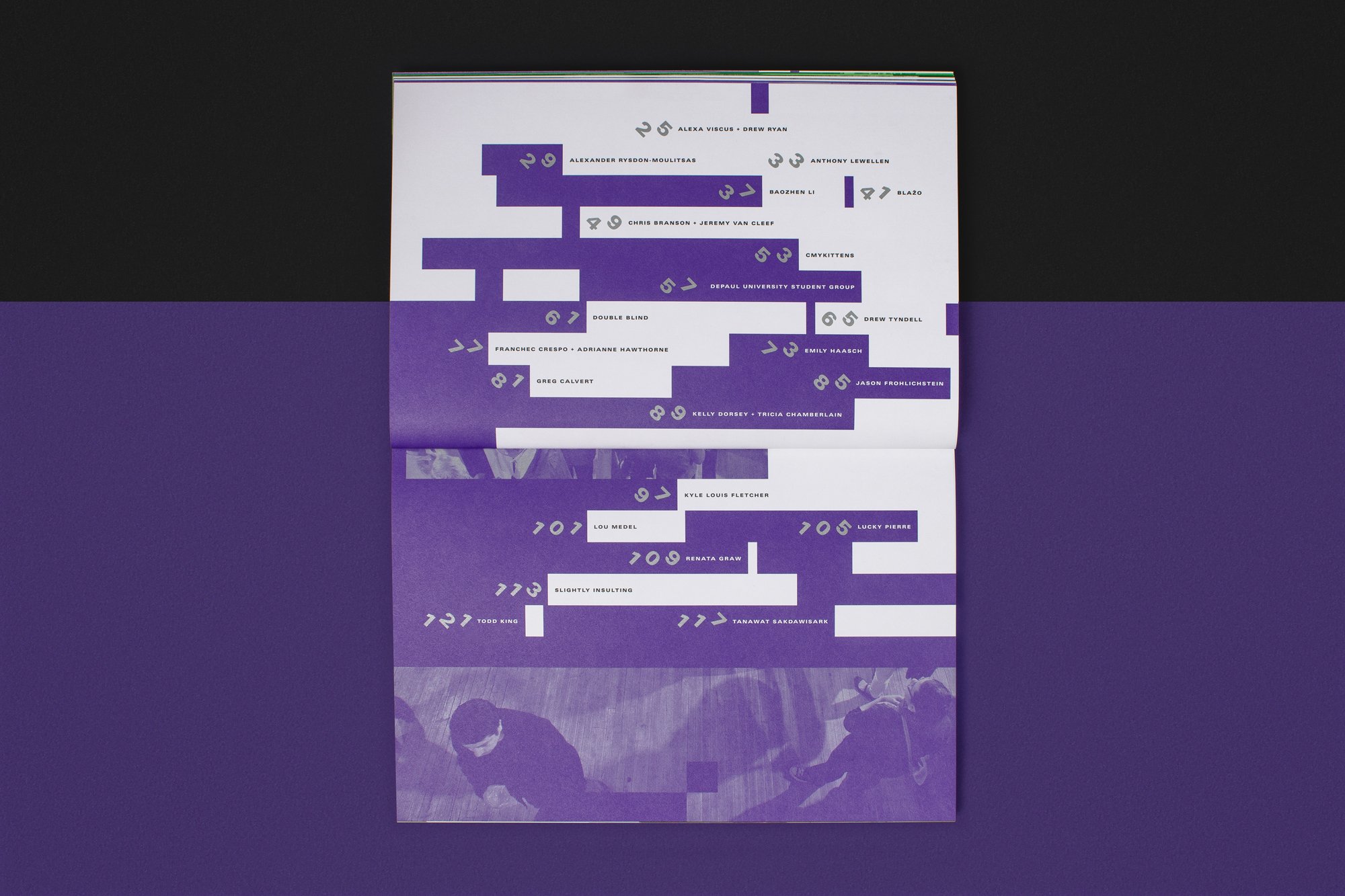
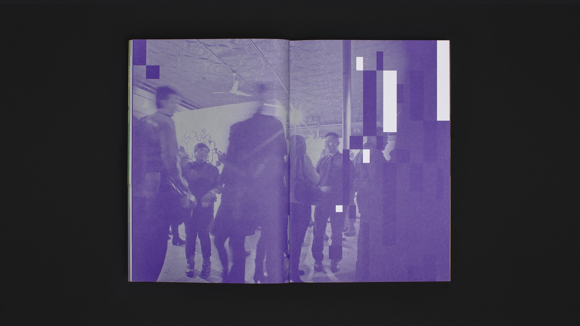
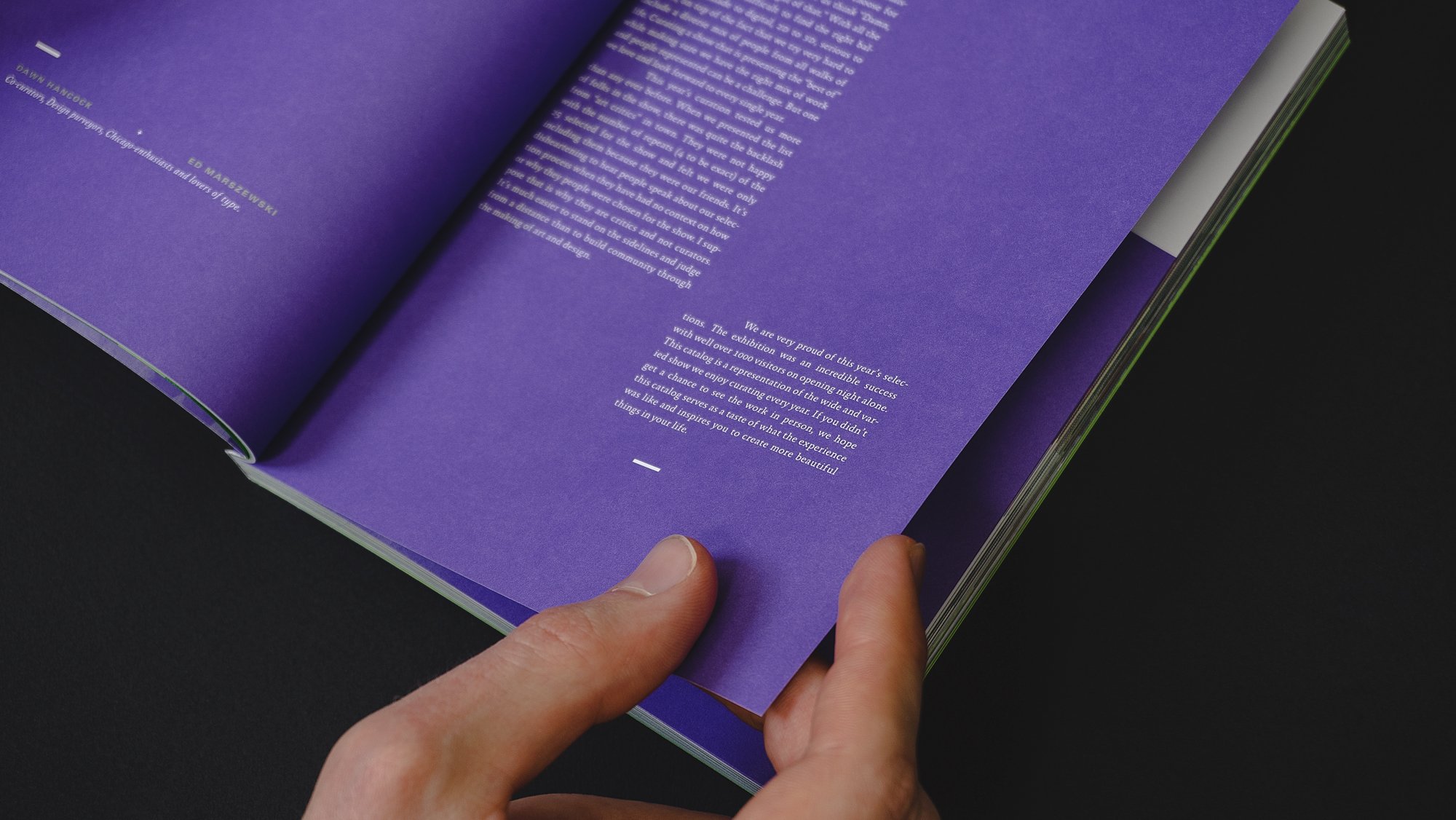
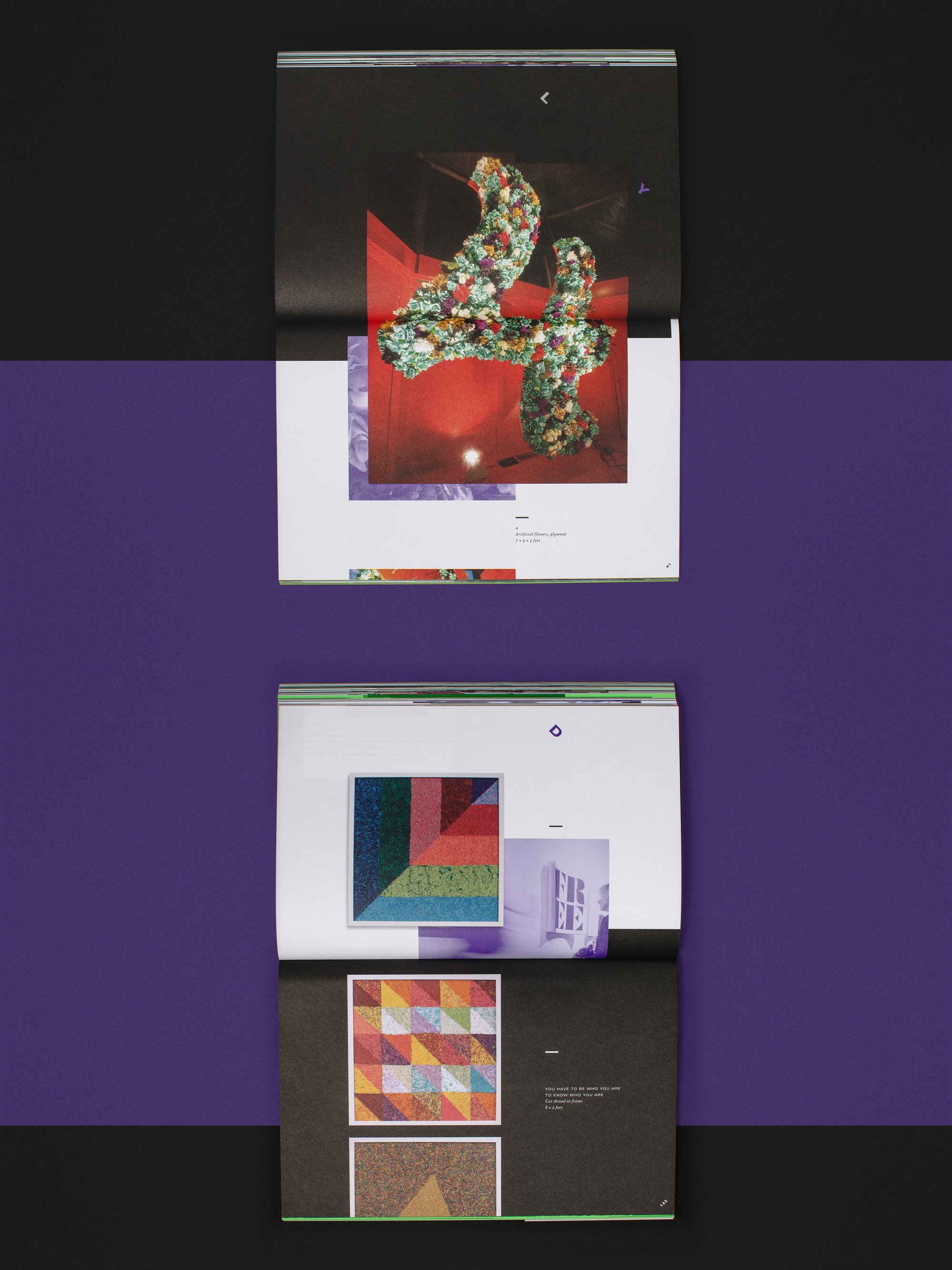
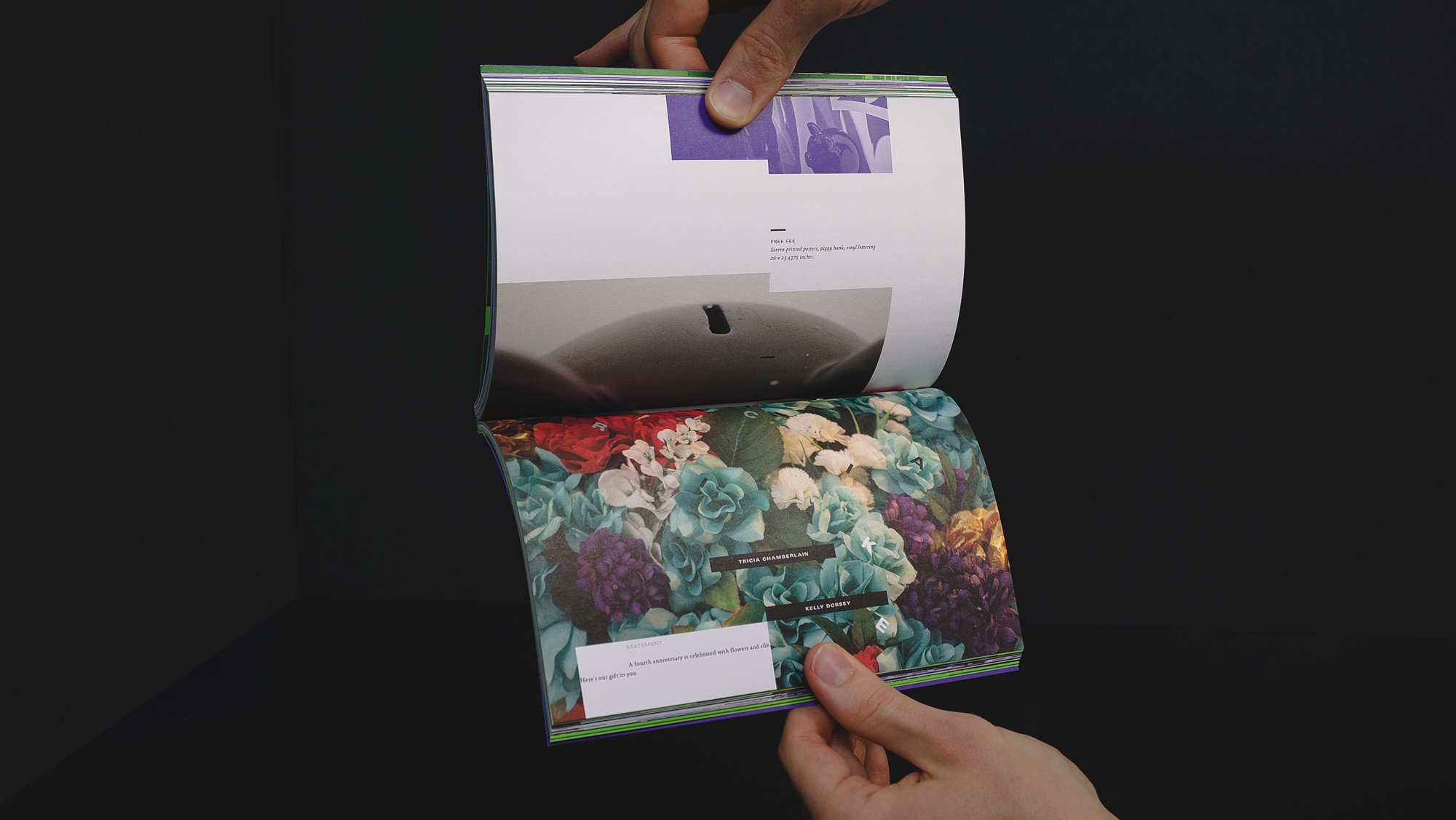
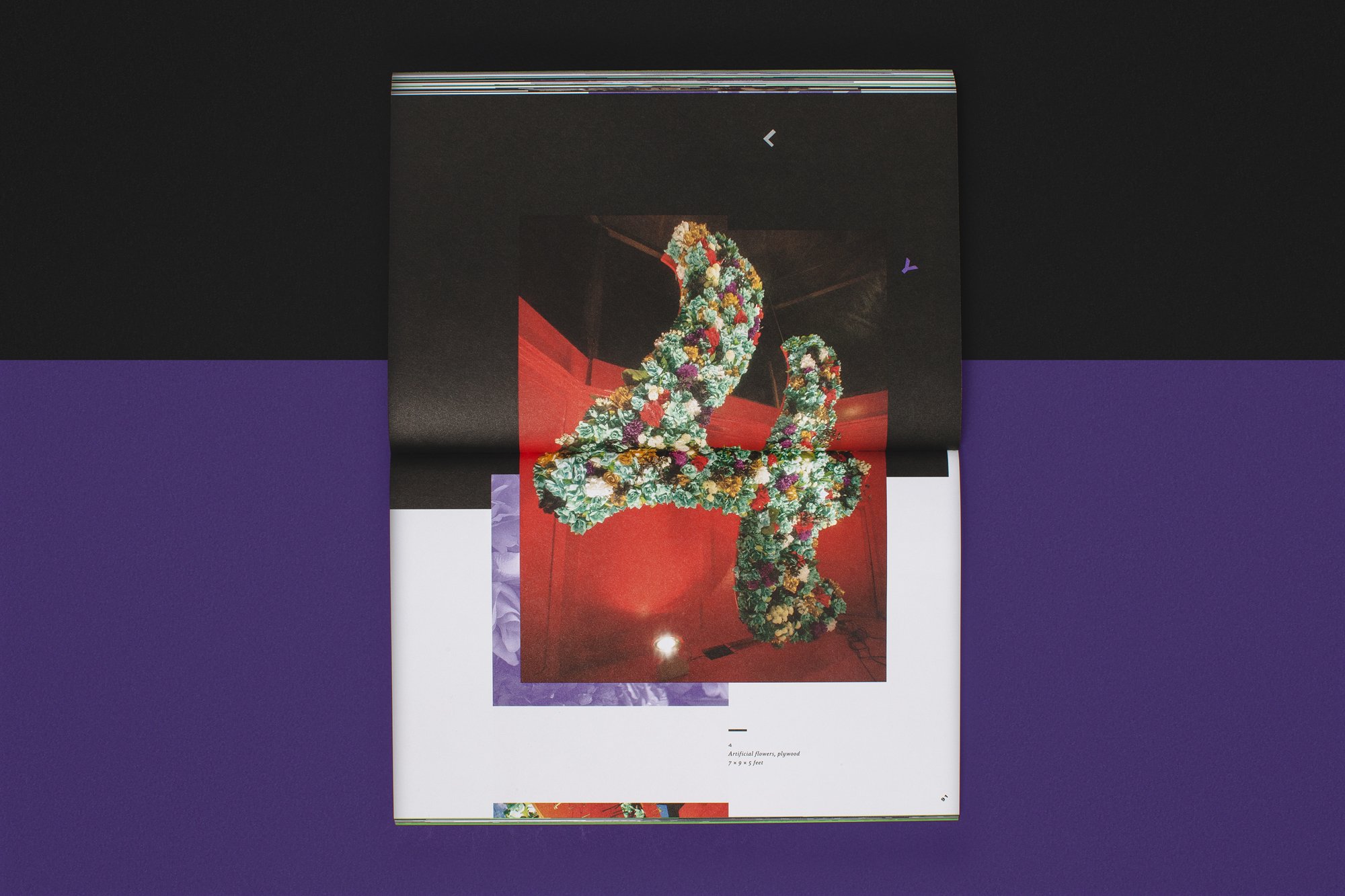
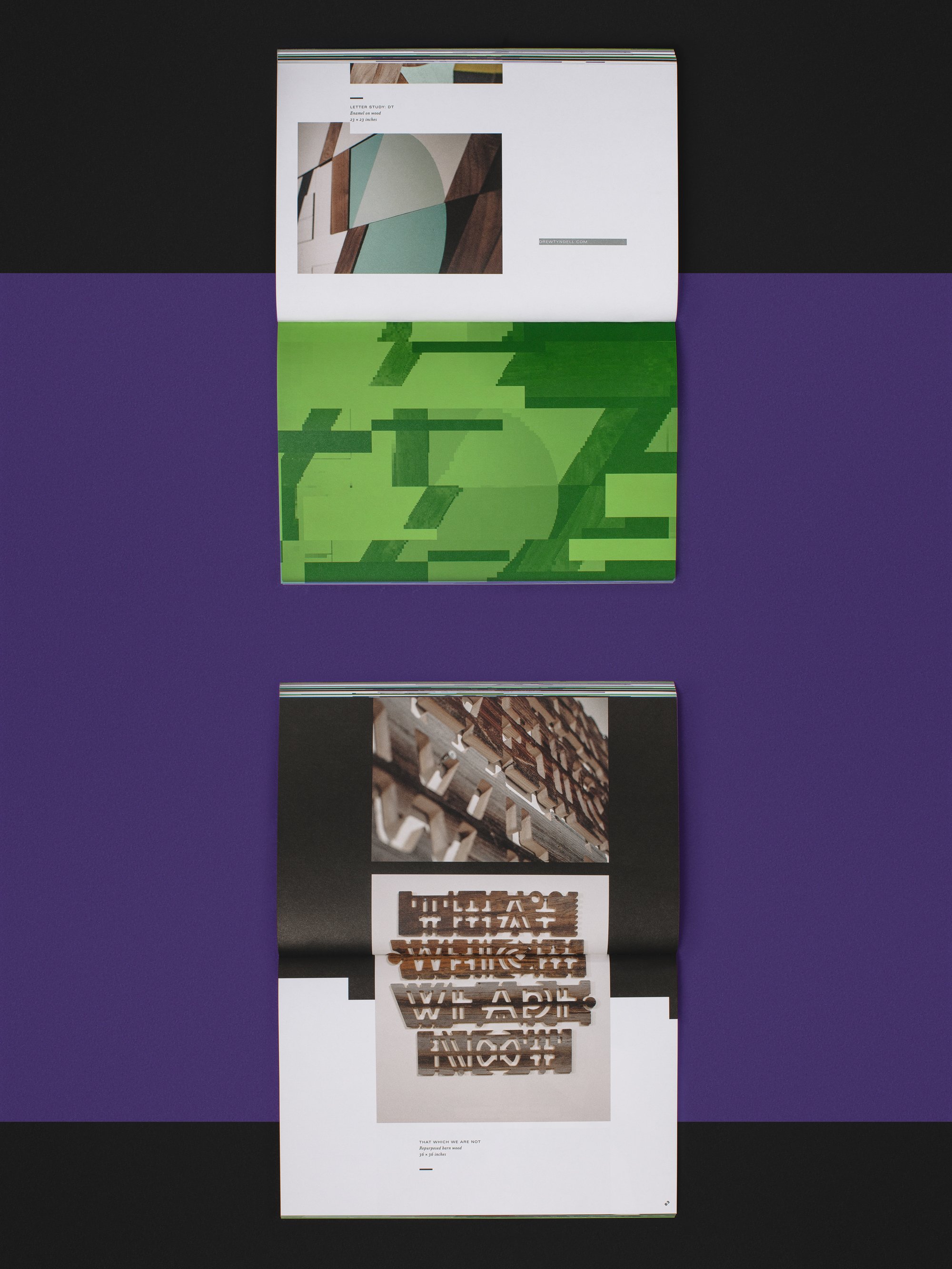
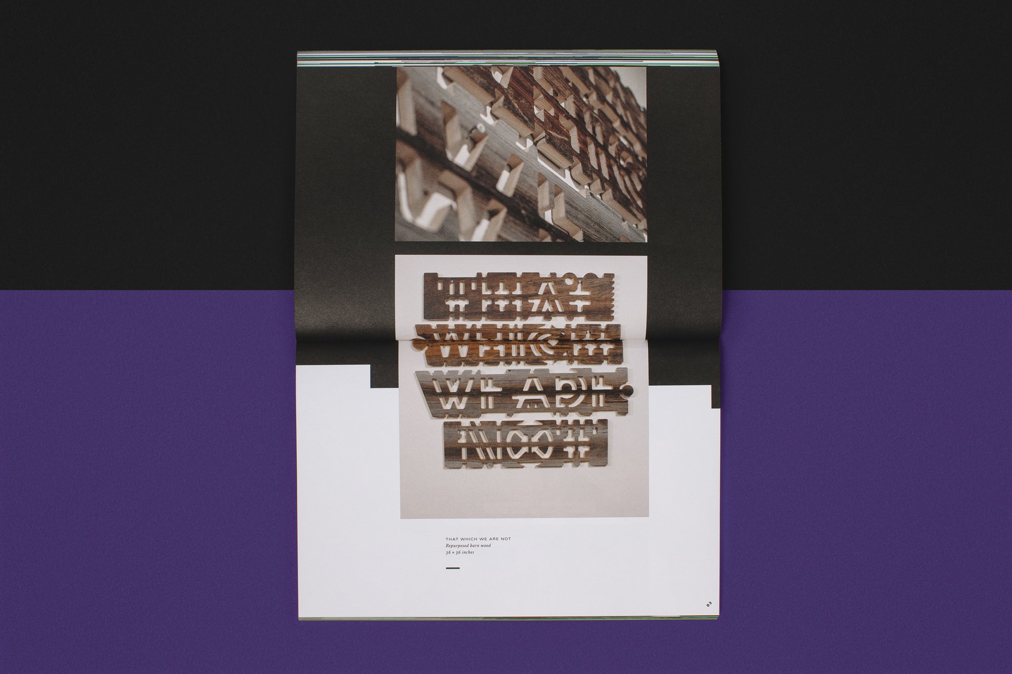
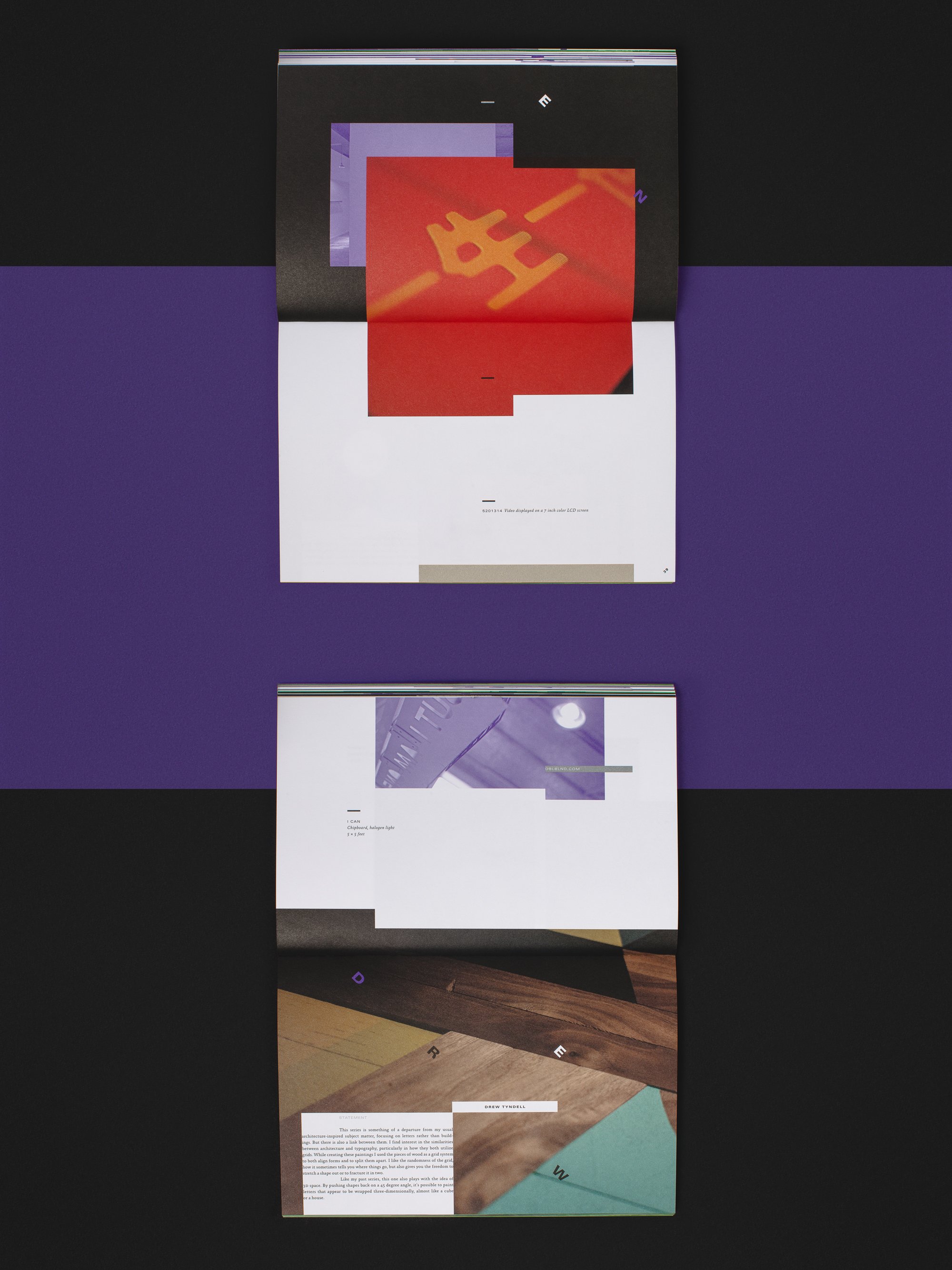
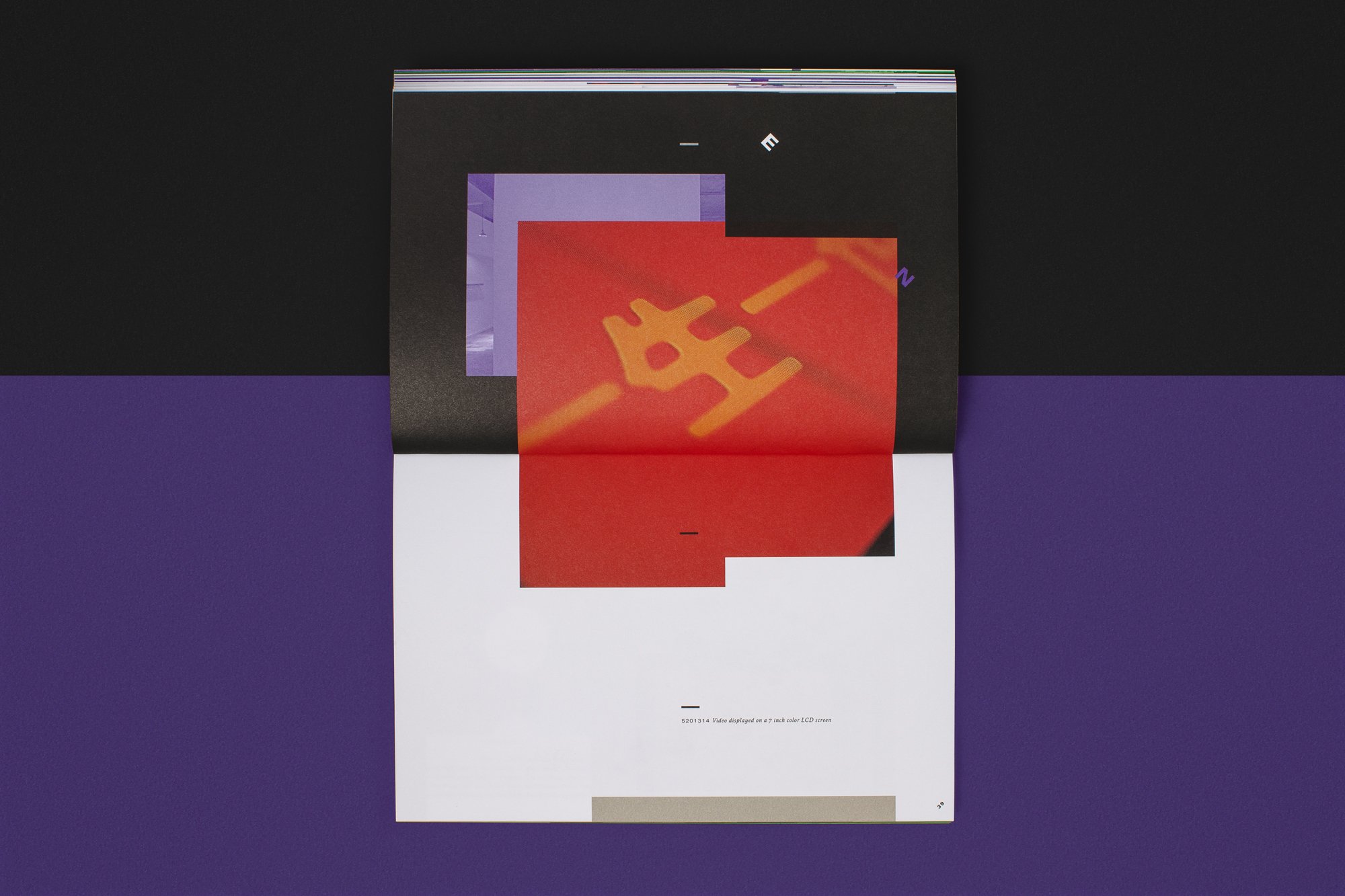
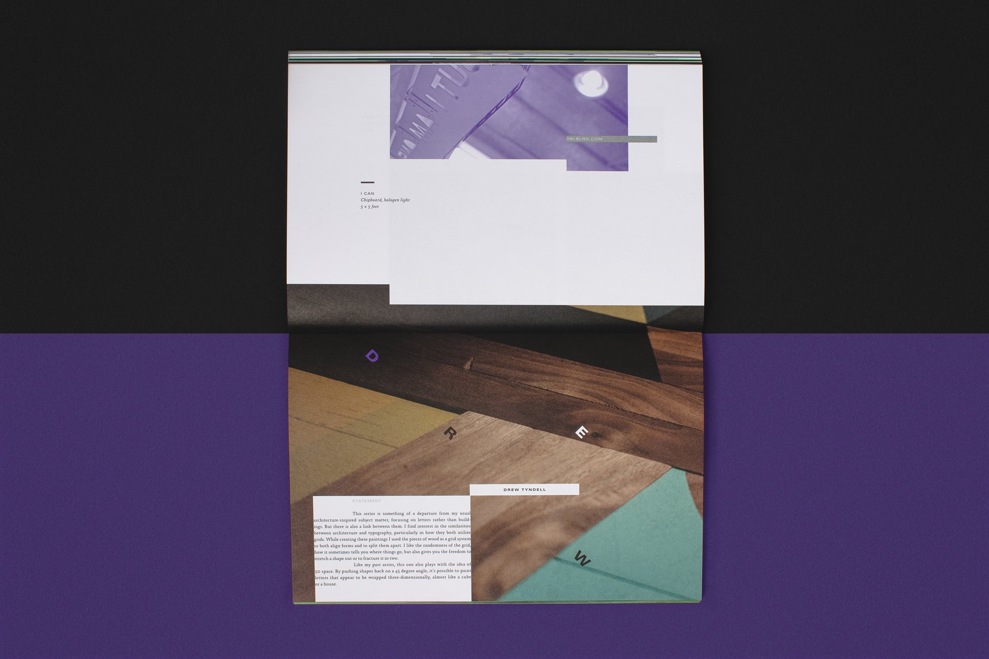
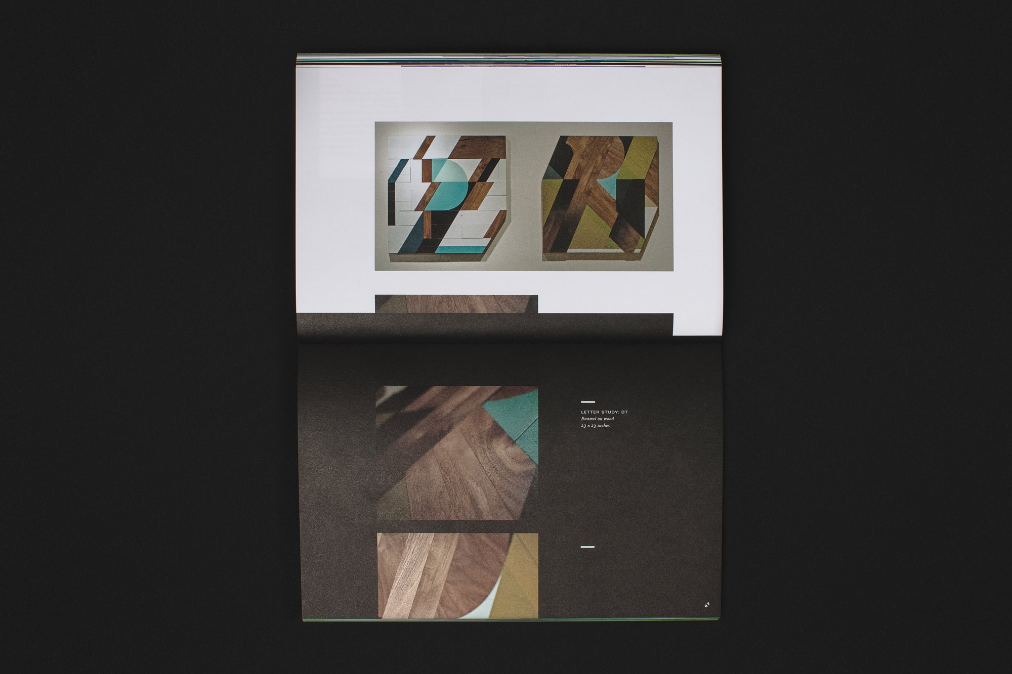
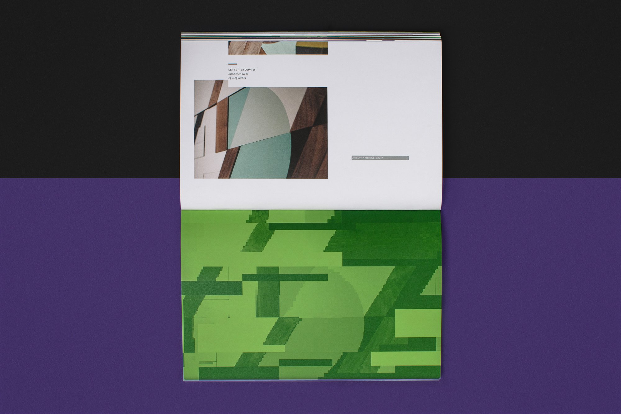
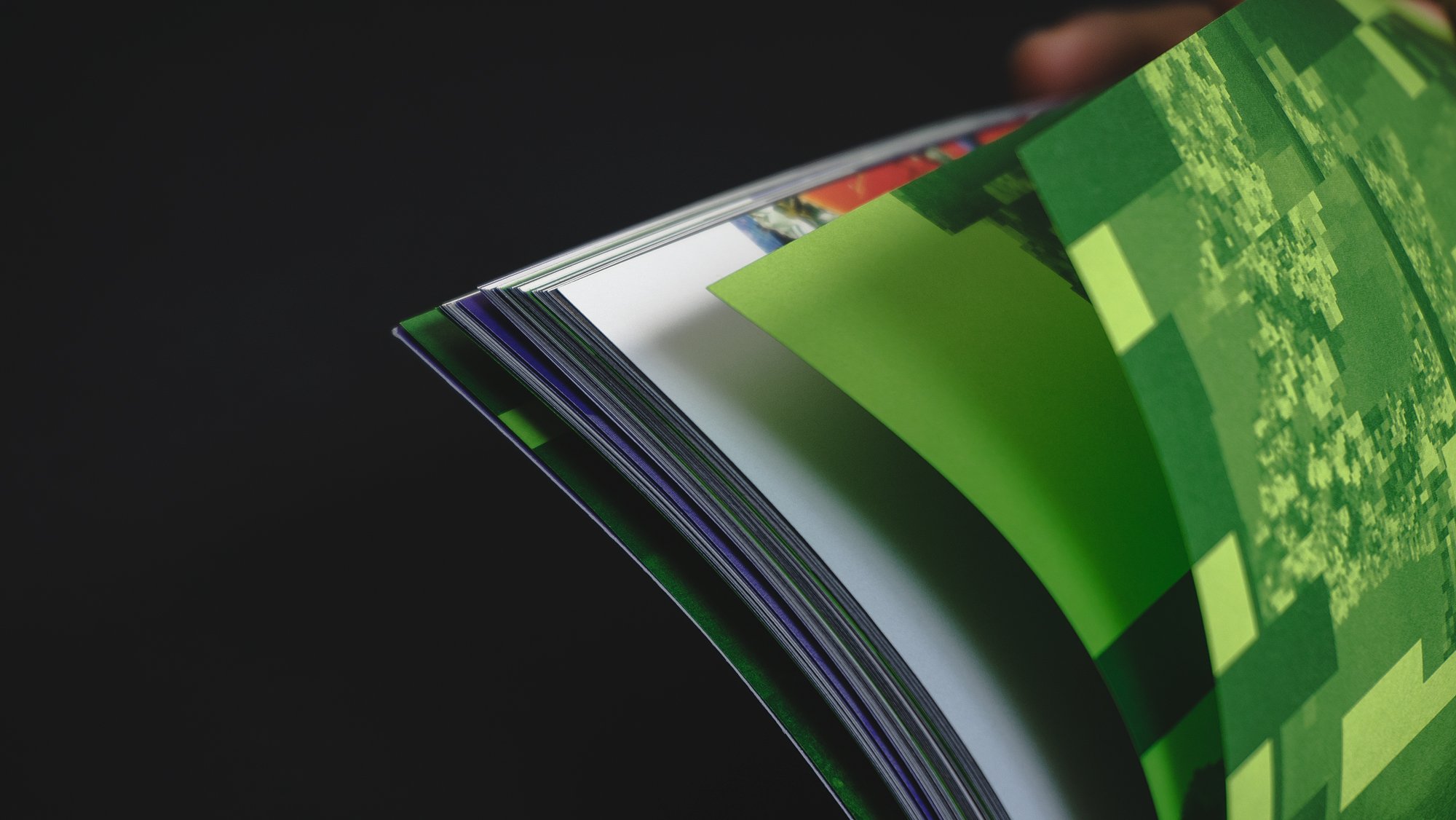
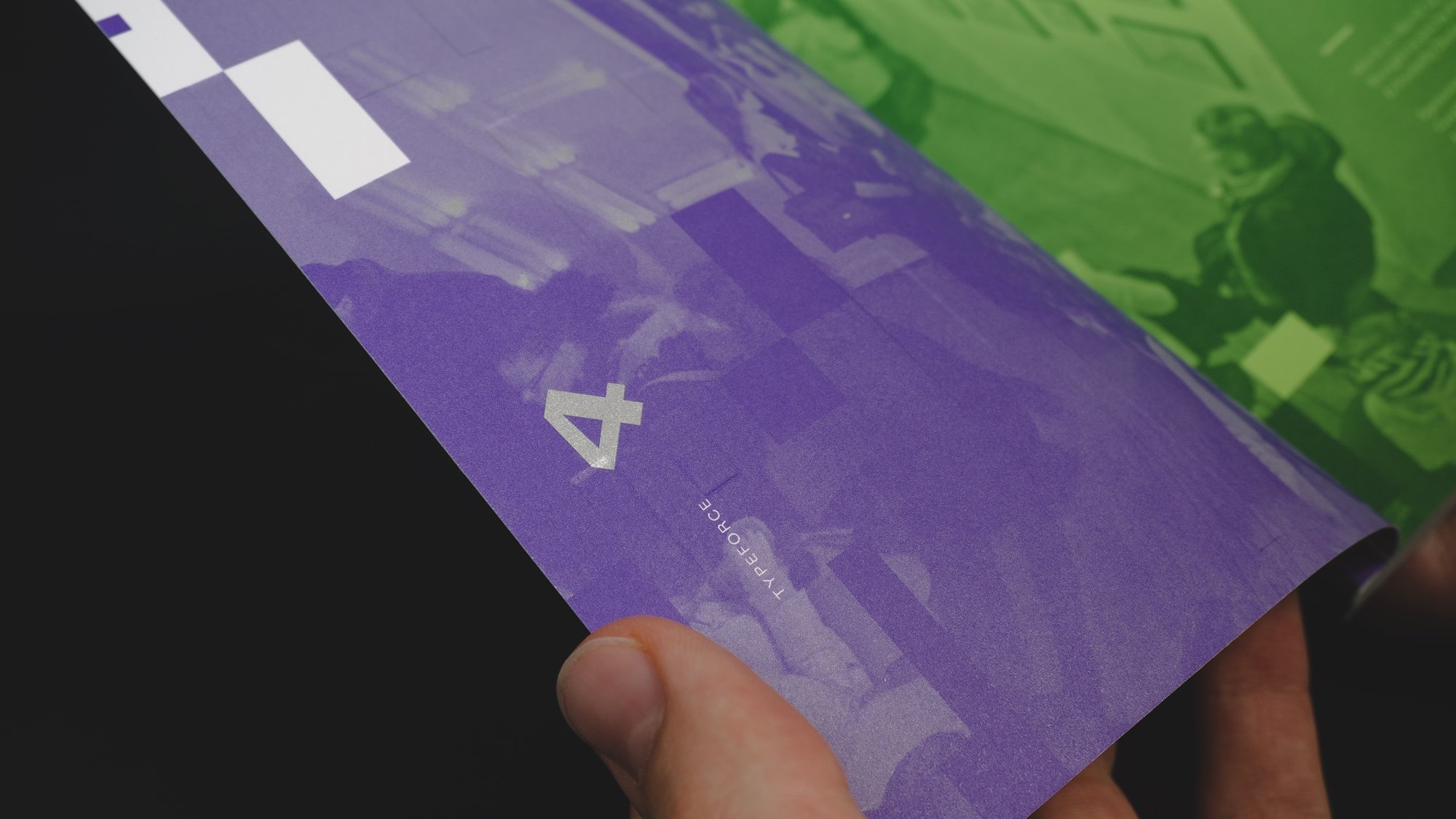
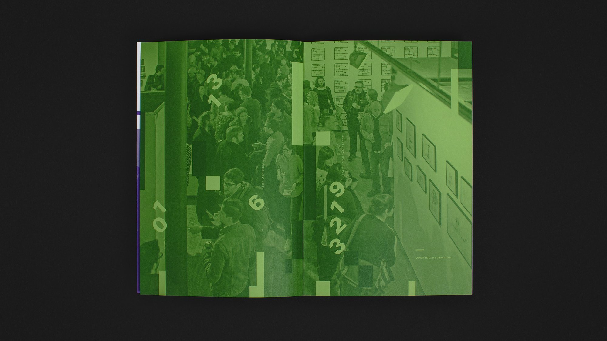
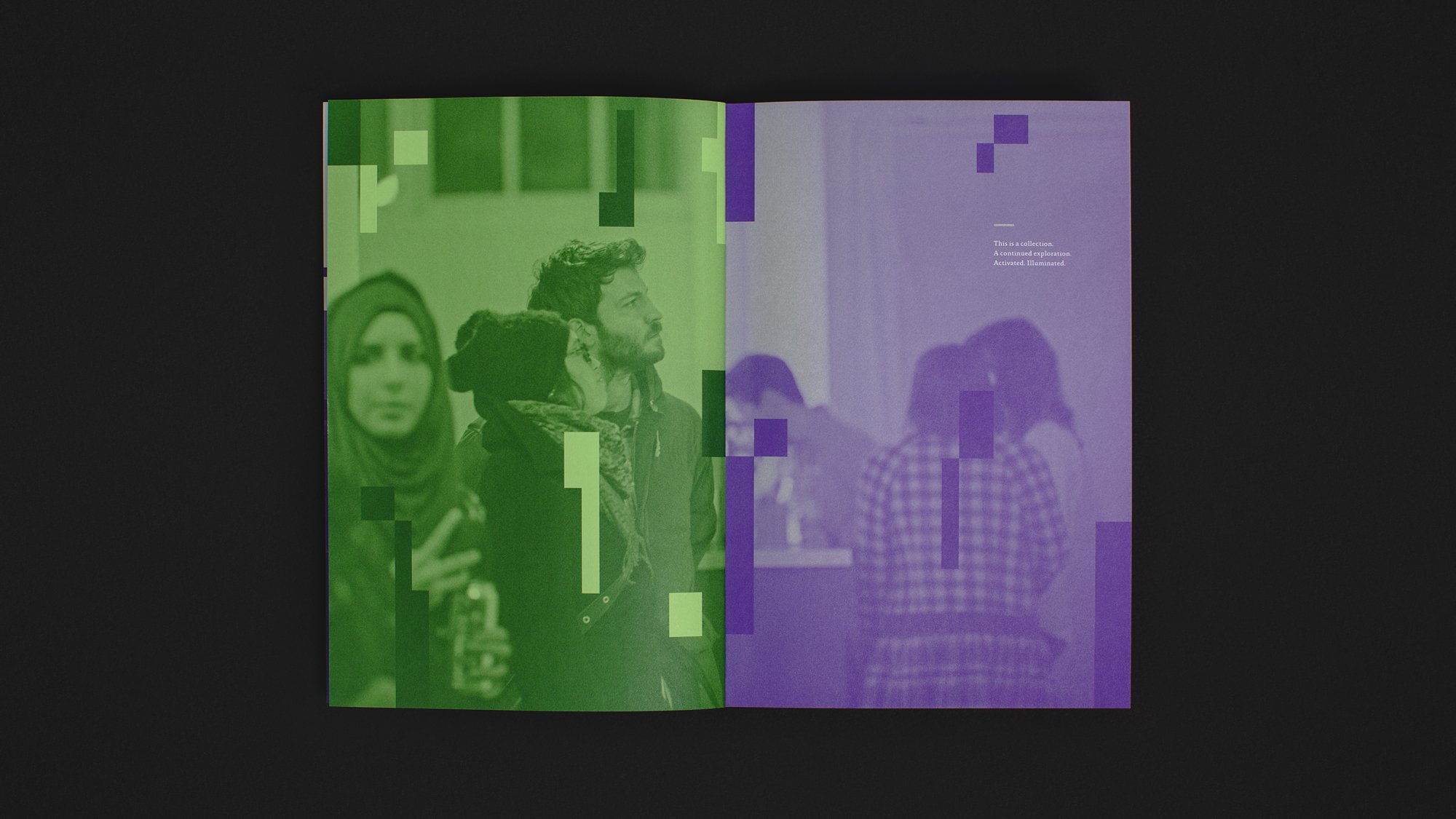
Throughout the book, interplay of traditional print and digital device crosses lines, hold hands and attempt to elevate each other's intrinsic values and flaws as post-exhibition documentation. In combination with traditional printing, the book cover used gradated metallic and dimensional holographic foils, from light to dark to create the simulated effect of an activated screen, a tactile "power on." The content is arranged to mimic a vertical scroll, a rigorously curated wall of consciously composed images capturing the energy and creative community of the opening night.
Production Notes
Typeforce 4 Exhibition Catalog was designed collaboratively with Ross Burwell and Nick Adam at Firebelly. Printing executed by Graphic Arts Studio. Dimensional foil cover finishing was executed by Rohner. Two paper stocks used, Cougar Smooth Opaque White and Domtar Hots Green were provided from Domtar through Veritiv.